Very good experiment.

Nov. 6, 2024
144
-

-
Beautiful setting with great colours. That hidden shack has aura of mystery.
-
Very attractive and well spotted.
-
Like that fire and drama in the sky.
-
Like b&w treatment. Well seen and captured.
-
Great series and colours .
-
Given choice I prefer this one, has more interest.
-

To paraphrase Crocodile Dundee ... this is an 'oops' ... albeit not so artistic, Alan ...
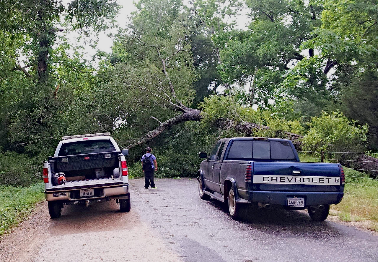
Encountered on the way back from town along the only road to the property, grump.
-
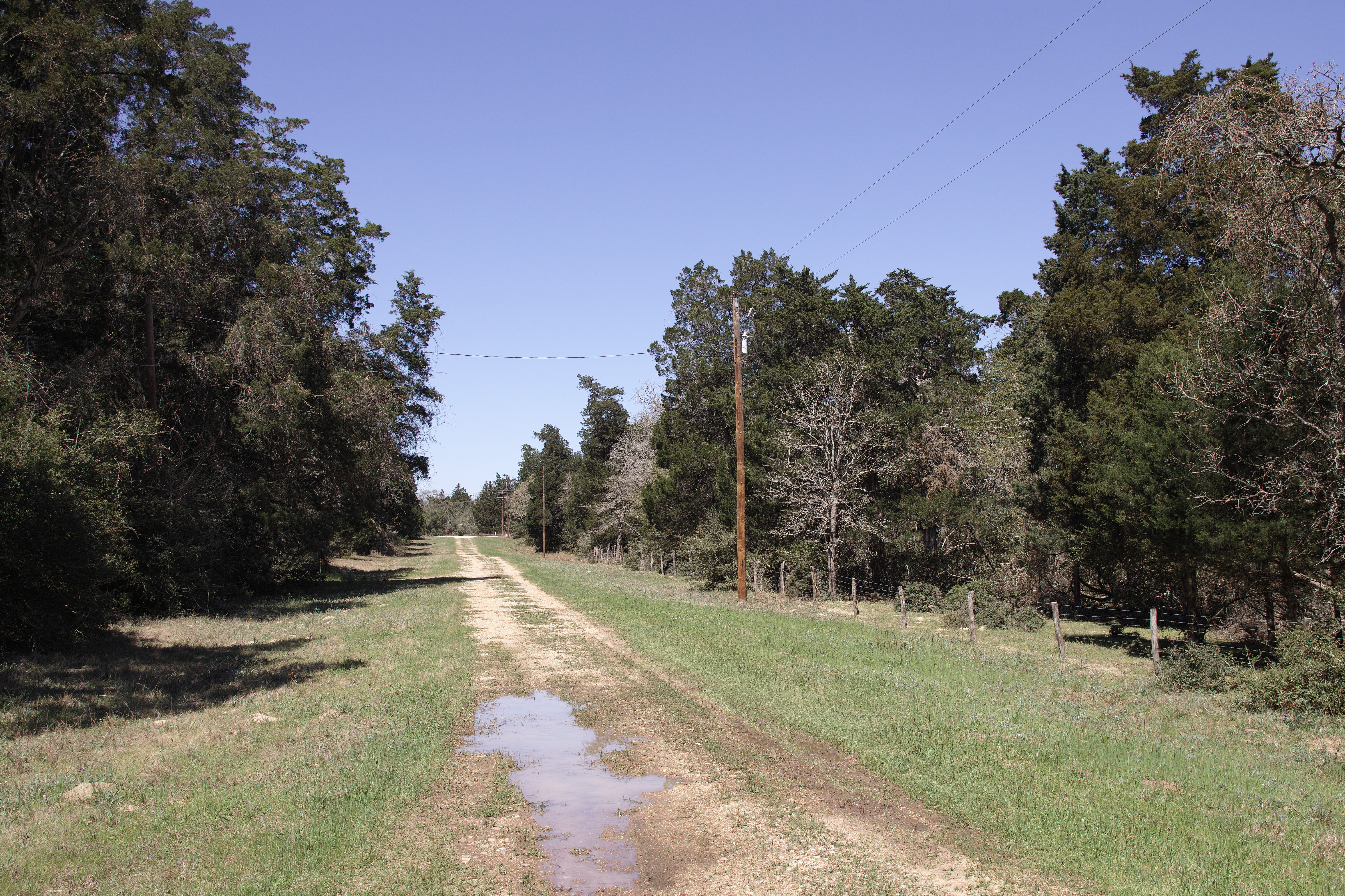
Rural Texas: dirt roads, 'bob wahr' fences and power poles:

-
AUTUMN WALK - Taking on board some of the suggestions
I was curious for the effect of :
- Mike's suggestion to crop to exclude sky
- Minnie's suggestion to flip the image upside down.This version below uses those suggestions, but I did not go so far as to exclude ALL sky, because that would have yielded either a very small image (in 4:3 or even in 16:9) or otherwise a narrow horizontal strip of an image with ridiculous aspect ratio.
This (below) is what I felt I could get away with in terms of crop and remaining aspect ratio (still very panoramic of course) : -

Arvo and Mike have given such good analyses of the design possibilities in these images that I don't want to trouble you with repeating, and I have little new to add to their comments. There's so much rich detail hiding in the images, and some brightening and clarity applied overall and in specific areas (along the lines of what Dan has offered but his is overdone for my taste) could help bring out the details you would like to emphasize. I agree with Mike that the fellow leaving with the bag is not a great addition to the interest. I too have wasted much time waiting for the Right Person to enter a scene that really needs an interesting human, but we don't always get what we want. Those times when we do teach us the patience to keep waiting...
-
Is he headed home with a takeout for dinner? What is that under his belly?
-
Thank you . I am still interested in this discussion because it doesn't seem to me that the colors you chose support the colors in the image, so I'd like to know why you chose them. The paint stripe's effect on the greens of the central leaves washes their color out to dull yellow and prevents the red and gold of the bug from benefitting from the color contrast with the rich greens. For me it calls more attention to the leaves (trying to figure out what's wrong with them) than the bug, who is pretty cute even if he is destructive, and in a great position to be eyecatching from a compositional point of view. It's your image and you are of course entitled to present it in any way you like but as a user of color overlays myself, I am still curious and hope you'll keep explaining.
-

Thank you Chris.
-
No problem minniev and they might not be overdone to some people, depending on how the images render on any particular screen.
The edits I do of other people's images in this thread are not intended to be final images but just visual representations showing what I mean in the post.
Anyone interested can then use my edits as a guide to do their own edits to their particular taste.
-

OK. A longer thinner format wouldn't have bothered me, Looking at your crop, keeping in very small bits of the sky is better. The touches of blue lift the darker colours and also give an edge that wouldn't be there if the sky had gone completely. It's the right blue to complement the autumn tones.
With lots of sky, top and bottom, the shot became a conventional reflection and was easy to pass over. The ribbon crop changes everything. I'm undecided about the inversion. When I look at it I have a kind of "Oh yeah" moment while I decipher what has been done. To me, the new ribbon crop is strong enough not to need anything further to give it impact and have us feasting on the line and colours. The inversion feels a bit "tricksy," -
Just for fun...
It needs some work to subdue the colors and tame the halo but I'm not near a computer and this is just a basic idea, shown from mobile.


