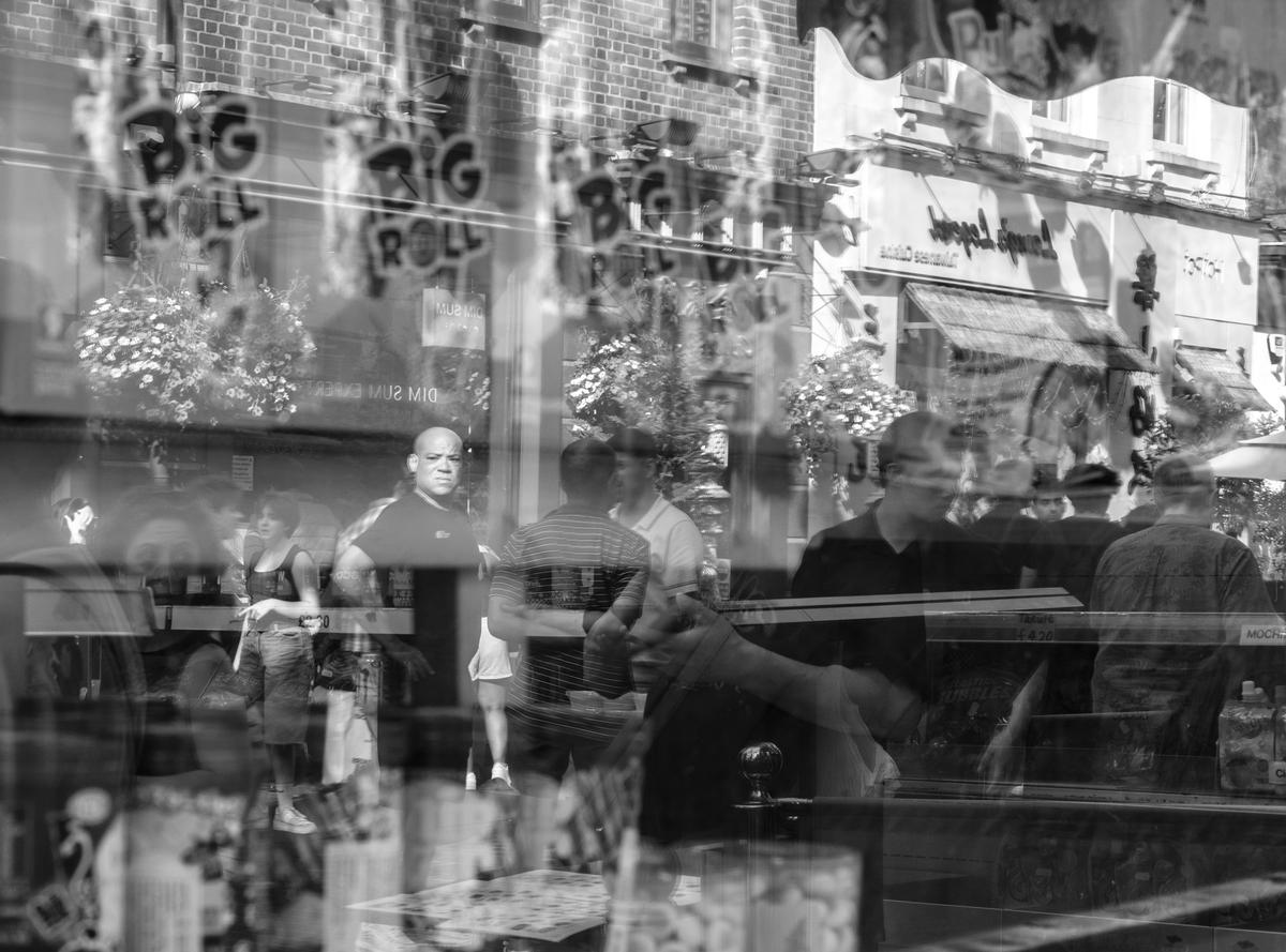
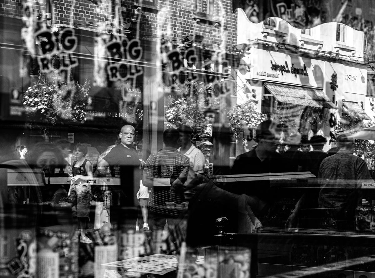
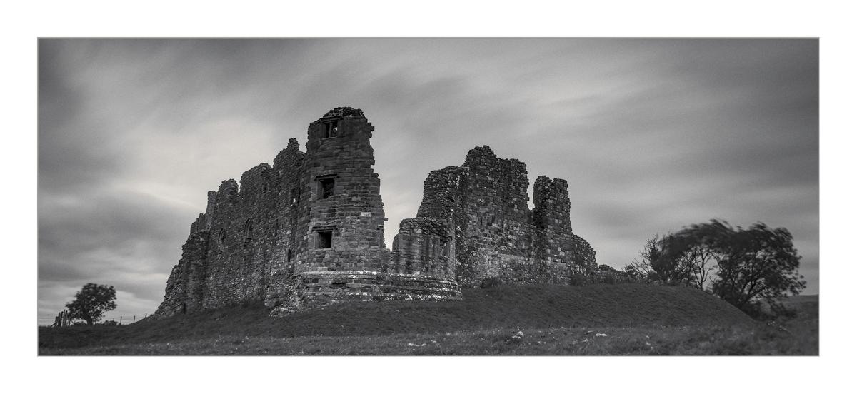
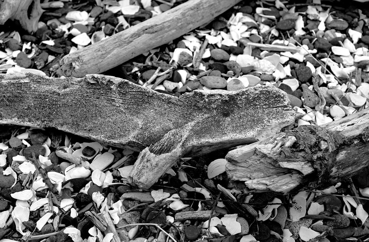
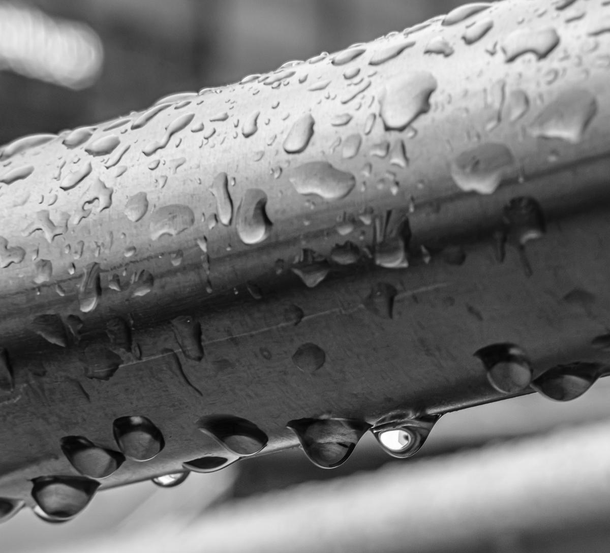
I had a play with some of the ones I posted above. I wanted them to be more 'gritty' and present a bit more 'impact. I've shown the originals with the new ones below. What do you think?
Increased the black and made the people stand out a bit better.
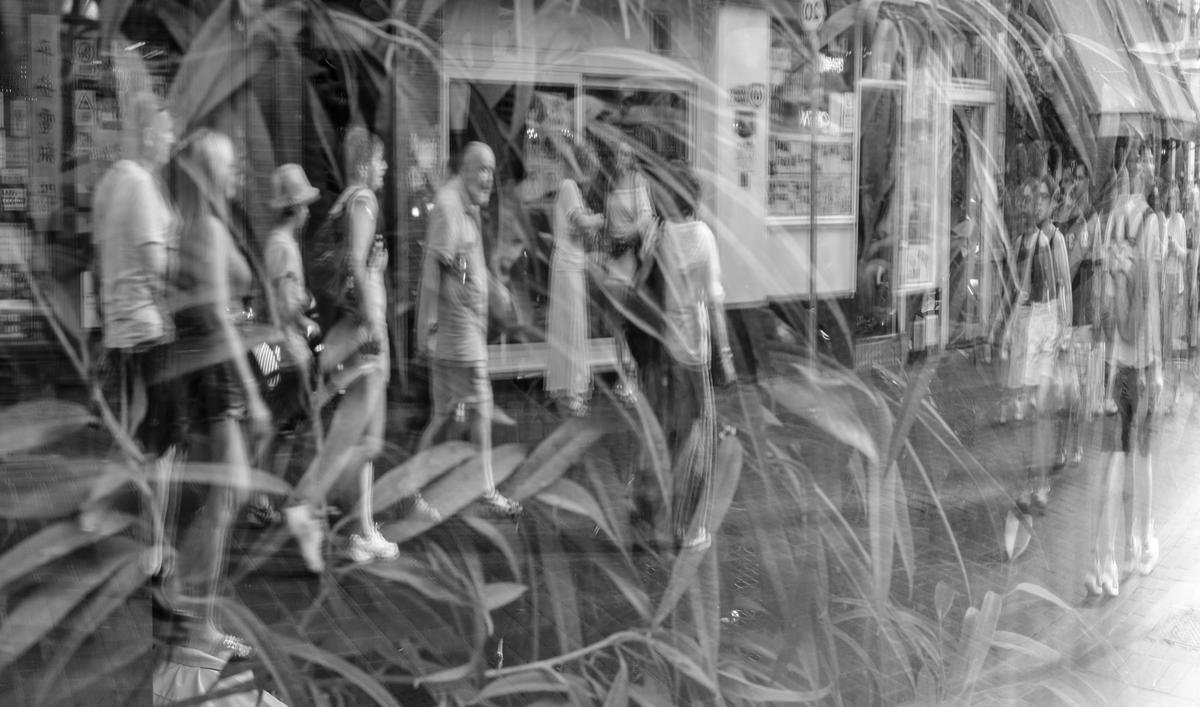
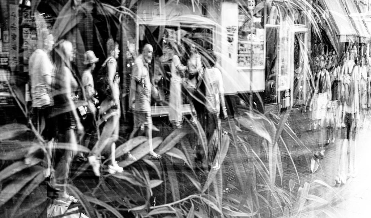
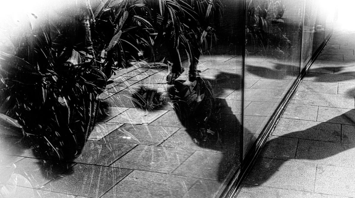
This one, I made the black much stronger and put a white vignette around to guide the eye to the centre. Did that work?
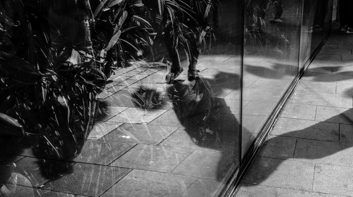
This one, I changed the B&W to a different simulation in LRc.