It's a very interesting and good photo.
The way the sheep jump after surviving the ordeal made me laugh.
And, the sheep don't look pretty afterwards.

Feb. 2, 2025
73
-

-

For those interested in the best way to convert various color images to grayscale, here is the ultimate evaluation:
cadik.posvete.cz/color_to_gray_evaluation/ worth reading more than once ...
...scroll to the right to see the result of the many methods of converting color to grayscale.
caveat: there is no particular method that is best for all images, meaning anyone who "only uses one method" could be suffering from tunnel vision!
-
For example, although 'CIE Y' (the ever-popular "luminance", or'luma" found in drop-downs for conversion) rates quite well for image #19, Method 'Bala 04' does much mo' better.
Even so, although most drop-downs don't provide you with all possible conversion methods, we should be aware that what we selected should at least be quoted in any post of a presented conversion apart from anything else.
-

That's an excellent resource that demonstrates what I said in an earler post about exploring adjusting individual colours and there being many ways to do it.
What the link isn't showing is where a beginner to B&W conversion might go to get the tools that allow the adjustment of individual colours to get the grey tone the photographer wants. The link I gave is to a simple way to do it from within LightRoom but as I noted, there are plenty of other paths to the controls needed. Silver Effex is the best known but it gets pricey.
tprevatt, you might consider adding xpatUSA's link to the resources. -
I don't think this info is necessary along with an image. We don't require anyone who posts a colour image to give all the profile and processing details.
If the OP however chooses to discuss these details, I'm sure it is appreciated. -
So it is that a suggestion intended to help the new B%W community dies the death-by-rebuttal. I fold ...
-
Now, now, Ted. Mike's response wasn't a 'death' - just an observation. Personally, I like following those links you put up. I get some interesting ideas out of them. And I am sure there are others who feel the same.
Alan
-

Not at all, very good link. It's interesting to see a perceptual analysis. Just to add... Although B&W abstracts in that it is the absence of colour it's important to remember that it doesn't change the way the human eye perceives and makes sense of what it sees. Just because we define the image as just a series of contrasts doesn't mean that our perception stops relating the image to our understanding of colour. Colours have a perceived luminosity, some we see as dark and some as light. Doesn't mean you can't change this, only that there is a limit that you can stretch this before the way we can relate this to reality breaks.
You can make very high contrast images, but when you remove colour you need to keep the shapes simple so we are relating recognisable shapes. If you tone map to oblivion while retaining every last detail then the image eventually becomes meaningless, first the sense of depth goes, then even recognisable shape and form disappear.
Example below, Say a blue sky over a golden beach. If I apply the B&W conversion on the right it looks as though I've inverted the image, a light overcast sky over the blue sea.
Anyway, a couple of digital, D600 and iPhone:
-

Is this thread for new r newish captures, or are some of my archive negs, scanned to C1 welcome?
-
Both. Scanned negatives are even more interesting :)
-
Black and White - no matter the source.
-
Conversion from color to monochrome is only one of potentially many steps in the process. Similar to B&W film, what the conversion process is doing is modifying the spectral response of the sensor/film so that colors are mapped to differing shades of gray. Enhancing the red channel is in a B&W conversion is no any different than an orange to red filter on the lens when using B&W film. It is often required as one can tell the difference of green pepper and red apple in the sunlight by color. However, on a black and white sensor or film - they may produce the same tone. You might want or need to separate those by changing the response of the film with a color filter or after the fact with a if converting from color.
There are plenty of tools available. The reference link seems to be more interesting in human visual perception is a valid question if one is concerned with a realistic interpretation of a scene. However, the reason many people do B&W is for abstraction and not to just produce an image without color. I find color boring, personally. I do really like the work of say Elliot Porter but color photography is not my personal cup of tea. After all Adam's Moonrise looked nothing in the final print like it did in the contact sheet and he modified the image over subsequent printings. The final printing was quite a bit different than the first.
An interesting aside. In my younger days I had a coworker who was legally color blind. He had 20-20 vision but could not see color. How he got a drivers license I have no idea but he did. How did he tell a red light from a green light - the red light is on the top or the right, yellow in the middle and green on the opposite end. For me my primary tool for conversion is Silver Efex Pro. It has the standard film simulations if you want a starting point. It has color filter emulations or you can hand modify or tweak the spectral response their sliders or both. It also provides fine tonal control that is a little more difficult in other methods. It is the best I've found. I will even run images produced by my Q2M (monochrome) through from time to time because of the fine controls on tone.
-

I'll just keep posting variious B/W film photos 😎

Tiger by Photobygms, on Flickr
Canon Eos 3 (HS version) and EF 80-200L (magic drainpipe)
Film used: Ilford Delta 400 and developed this one with our Caffenol-CL recipe, stand developing at 21c and 55 minutes -

-
A composite rendering - moon, street, clouds, UFO:
grayscale
-
Very interesting shot. I really like the expression on the tiger's face - seeming inquisitive.
-

Here's one where I removed all the colors in post except orange.
I call it "The Burning Bush" (I was in a Moses kind of mood that day).
It was kind of bleak and dreary day, but that bush was still blazing its orangeish/reddish color. I never did figure that one out.Steve Thomas
-
I have scanned all my performing arts photography to digital over the past couple of years. The negatives are now in the archive of our provincial theatre.
Here are some of my favourite Jazz musicians, that I got to photograph back in the day. Mostly with a Nikon F801 and Tamron 300 2.8.
Joe Henderson
Pat Metheny, a favourite musician.
Enrico Rava
Chick Corea
Hans Bennink -

I spent years using film. I had my own darkroom. Processed my own film and prints. Since about 2002, I started to use digital as well. I just got this new camera. I'm learning how to use it. A set of lens filters is on the way. It should react somewhat like B&W film. I've made about 60 images so far with this camera. I've converted many color images to B&W with my previous digital Nikon's.
1
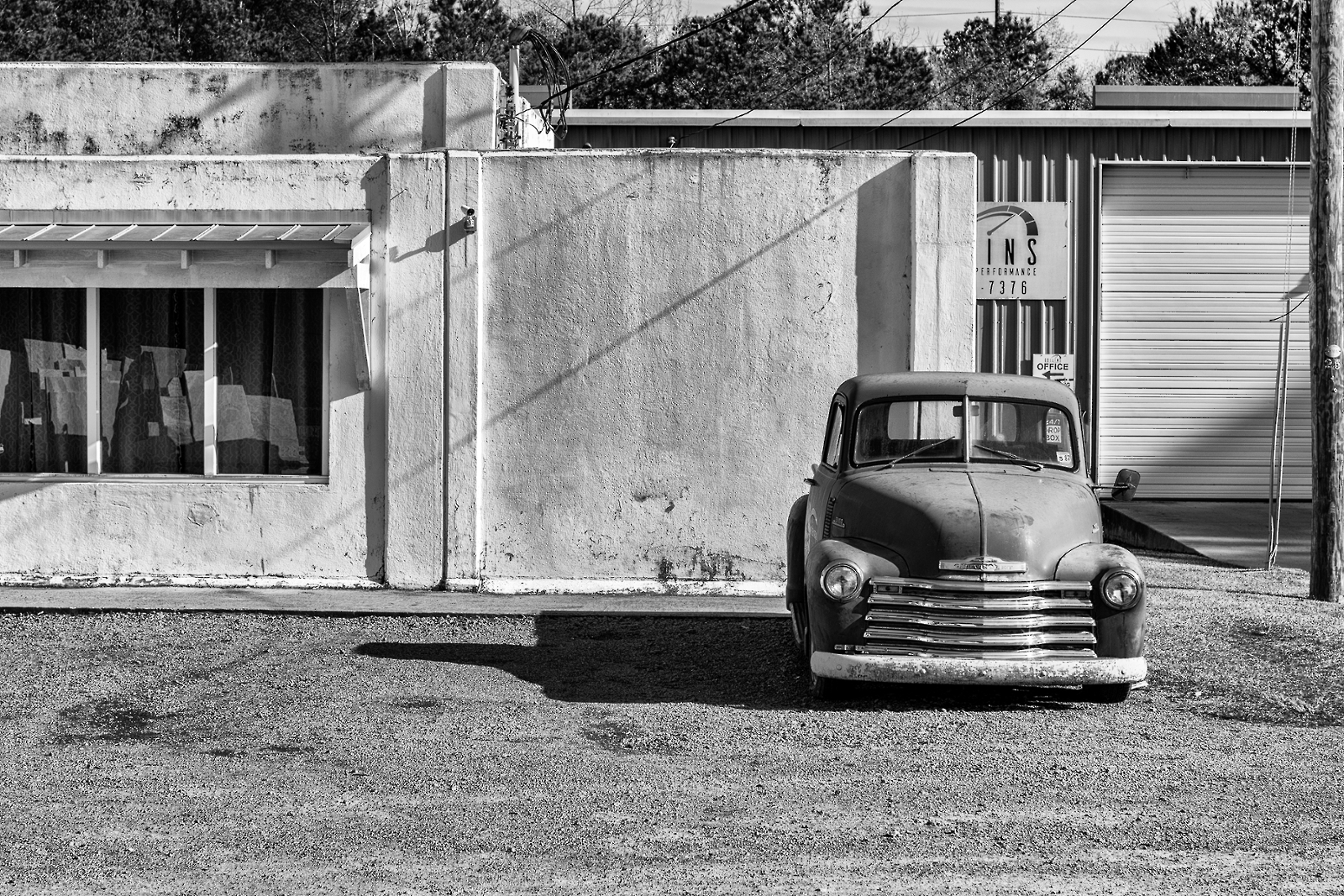
2025:02:02 15:07:41 : PENTAX K-3 Mark III Monochrome : 77mm : 200 ISO : F7.1 : 1/800 sec : 0 EV2
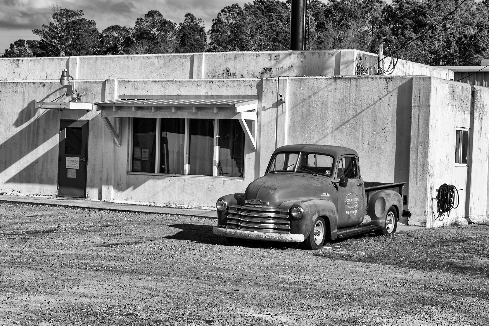
2025:02:02 15:10:30 : PENTAX K-3 Mark III Monochrome : 77mm : 400 ISO : F5.6 : 1/2000 sec : 0 EV -
Good story - the jazz players. The first of the sax player is a particularly good story. You can feel the pride he has in his craft. This is along the lines of the famous W. Eugen Smith's image of Thelonious Monk in his Jazz Loft project photo essay. The slow shutter speed giving an illusion of motion is also a nice touch - particularly with the keyboard player.
-
A story of Americana and a slower way of life - hard to find today. Two years ago on our annual pilgrimage to the West to escape the miserable FL summer we got off the main road in SD and followed the Missouri river and in this small (and I mean small) town in Nebraska where we pulled into a roadside picnic area to have lunch, we discovered we had just gone though a time warp. I'll post a few images later.
-

Tractor Man
Mr. Louis, AKA Tractor Man came yesterday to work on my 1951 Ford tractor. He is a decade older than the tractor. and a mythic figure. To get his services you can't call him, you must travel many a gravel and dirt road into the wilderness and convince him to help you. If he agrees, he will show up in an ancient pickup, wearing a fedora, will carry his bucket and a bag of tiny tools, sit on the bucket and set to work. Processed in Lightroom and Silver Efex.
-
Nice story. You captured it nicely. The toning is a great touch.


