Good to see you again Jonas! A nice little triptych, a trio of photos with a logical and artistic sequence to describe a personable and very cute little girl emphasizing her most immediately noticeable feature: that wild and amazing curly hair. Though I don't have Rich's extensive experience, my impression is that more white space between and around the images would be a good thing. Agree with Rich about the black border. There are areas where the bright sun has leached color from her shoulder and her hair. That looks like it works great for the hair, less great for the clothing. Looking at it online, all of it processes visually as a set of lovely images but getting it to render the way you want in ink and paper may give you some challenges. I would be very careful how and on what I printed it.

-

-
Because I really liked Jonas's removal of the sky section, and Roel didn't really like switching switching from the square format, I tried a crop that does both.
I really love that little kit 40-150, which is better than it has any right to be. Weighs nothing. Mine (free with my first Oly m43 camera) finally fell apart after a decade of hard use, and I got another one used for about $30.
Again, a great image, no matter how you "slice" it!
-

Nice use of triptych to tell a story, almost like a little film strip presentation with very nice movement from left to right. Beautiful little girl, as are all little granddaughters.
I'm not a fan of the black border. [...]
I would not allow any program to wring my images out to sRGB space. Not knowingly, anyway. sRGB is not a real color space. [...]
[/quote]Thank you for looking and commenting Rich, and for the nice "film strip" comment!
Yes, granddaughters all have some universal trick when charming the previous generations.
I get it, no black borders. I still wonder if there should be more white space between the images and also a little more at the top and bottom of the frame.When it comes to color spaces, we seem to think in diametrically opposite ways. I like the idea of knowing everybody get the colors reasonably "right". So, sRGB it is for anything i do on-line. For prints I use aRGB. I understand your approach as well but have given up to reality. There are however small signs giving me hope most screens will handle aRGB in a few years. Applications automatically doing things, including convert from a color space to another (something I never heard of earlier) should be banned.
See you! -
Hi minniev,
The little girl is 2,5 y.o. and her greatest feature can't be seen but really is that she recently started to speak properly. Until a couple of weeks ago i have understood in total three or maybe four words only. From frustration to fun!Thank you for your comments and ideas.
I now totally get it: no black borders. Bigger white areas I agree about. I'll have to redo this one.
Sometimes I think I get this with triptychs but in reality I have to think and try a couple of ideas before getting satisfied.About the colors: They are kind of wild. For a change I tried some of all these "filmistic presets" you can find everywhere. This one is supposed to make the images look more like some brand of negative color film. From time to time I can't help myself and revert to stupid experiments. I think that is an illness since the I got to try an old Rank Xerox color copier for the first time. It was possible to project images to it using a slide projector and a mirror. Crazy stuff, and fun.
If the poor childs mother would like the triptych printed I think I can make something decent from the raws. Without borders. For now it goes on-line only, in line with your thoughts. Thanks again!
-
Just to be clear, I really like the color palette. I too am an inveterate fiddler and experimenter, and old film emulation is one of the many toys I like to play with. I was just warning you about the patches of bright reflected light on her jacket, especially the shoulder, and the very top of her head that may not be easy to render in print.
Aren't grandchildren the most fun there is in this world? I adore my 3, but miss the magical stage your little one is in.
-

No, Topaz AI is pretty good.
Her face looks like a figure in a wax museum.
And there are even square patterns on her clothes.
Mike should have seen that before! -
There is so much to complain about, but I really like these photos.
-
For some uses, Topaz AI is ok, but even when applied lightly it often gives me people who look like the zombie sisters and brothers of Mike's lady here - too much skin smoothing, sometimes strange facial distortions, and too many weird artifacts.
The square pattern is an oddity that I'm not going to attribute to Topaz AI since I've never seen it render such as that and I can't figure out quite how it could. What do you think it is? It looks more like a sensor pattern to me but I am not familiar with Sony cameras. Maybe an Interaction between camera and Topaz? There was a pattern in an image from this same place that Mike posted last week, but a quite different one. What it had in common was prevalence in the dark greens. I'm not sure what's going on. I've had some weird artifacts erupt in images I took in dark places with high ISOs. Hope Mike can sort it out!
-
Cool, and thank you for commenting!
-
...an inveterate fiddler... Heh, I like that. Digital has made it very easy, or simply put, possible!
No worries, I think I took the message as it was intended. print... My printer died some time ago and I miss it. I guess I'll have to buy a new one at the end of the summer. -
I went back to last week and had a look at Mike's last image from the wonderful Milkbar. Wooden ribs in the seatings!
I have used Sony cameras since i bought the RX1 back in 2012 (I think) and I also have owned the A7CR (great little camera) Mike used at the bar. The modern sensors of today are great and the only sensor-related pattern i know of is the phase-AF line that sometimes can show during certain circumstances. The square pattern is strange and doesn't look like anything I ever seen. The shadows are also blotchy in a way I thought was a thing of a distant past.
Yes, I to really hope Mike can sort it out! -
I've really liked the exchange of ideas around this triptych, and I also like the images themselves. There is a dynamism there, with the full body portrait first, and then a close up with turned head that gives way to a face. The inclusion of that middle image gives the whole a sense of motion.
-
This may be part of the story. community.topazlabs.com/t/strange-pattern-in-the-background-after-processing/49711
This claims to have a fix community.topazlabs.com/t/resolved-in-v3-5-2-square-grid-artifacts-on-mac-click-here-if-you-get-this/85859/199
It seems it is an interaction between sensor and Topaz software.
-
On dev2.dprevived.com we have changed the thumbnail size. If you wish to test it out, you can log on with the user id of "test11" and password of "Testingonly". Create a post, add a picture and see what you think.
If it all looks OK there, I think we can make the changes on the production site (this one) quite quickly.
Please report back here when you've had a play.
Alan
-

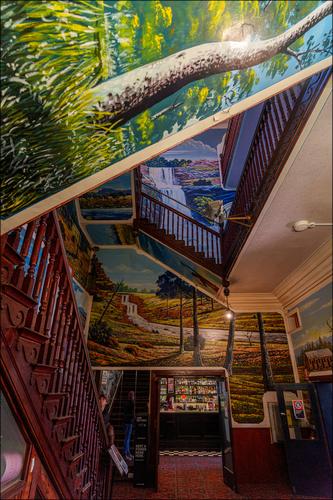
Mario's Palace Hotel. Broken Hill.
The Palace was a temperance hotel in the heart of one of Australia's hardest drinking mining towns.
You will find what happened next here.
www.weekendnotes.com/marios-palace-hotel-broken-hill/
The hotel has been used as a set in many films.
Sorry, I have been super busy and hadn't had much time to look at last week's thread. I'll repost this Hotel image to the currnt week and then I'll dicuss the milk bar image.
-
First. I really wanted that hand in the shot right where it is. I knew when I took that shot, hand held and with no time to set things up, it was very much an opportunistic grab, that the image would be too dark but I put my faith in Topaz.
It has been an unusually busy time at home and I spent almost no time on the PP. Topaz has lots of possibilities when it comes to strength of effects and the size of areas being worked on. This shot had the absolute minimum of PP playing with done by me. With more time I'm sure the hand could be done better. The patches are another matter and I've seen it happen before. They only appear after the image has been through Topaz. While they annoyed me, it didn't bother me too much as they only showed up when viewed quite large and I wasn't preparing the shots for prints.
I don't think it has anything to do with the sensor.
It may have something to do with the order in which I used PP. The shadows needed to be raised and I did this before using Topaz. It should have been the other way around.
When I get some time, I'll experiment with this further and also try another noise reduction program.
As an aside. there is another photo this week from The Bell posted in the B&W thread. In this shot I deliberately didn't do any noise reduction -I wanted the noise and grain appearance. -

Hi Alan
I've uploaded some images on the dev2 test site and the previews now look very good, (Link)
They are much better than the current previews 😃Uploading was very easy, it's just the completely normal uploading method, that we all know how to use👍
-
Thanks. We have some other issues with dev2 at the moment. So, until that is sorted, I'm not doing anything to prod. But we do have a way forward.
Alan