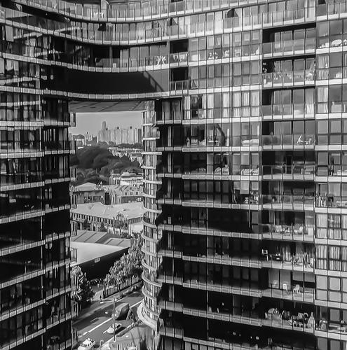
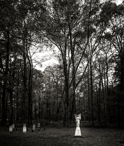
A beautiful, serene image.
I re-worked the tones a bit to give more drama to the light falling on the white figures and the deep blacks of the woods.
Hope you don't mind.
Rich
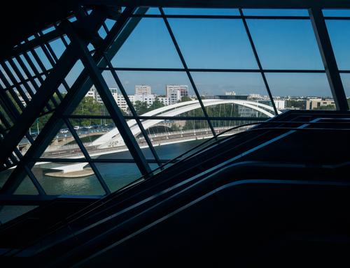
A few weeks ago, Roel posted images of the Musée des Confluences in Lyon (see here ) which is architecture from a photographer's dream. This photo is also taken there, but from the inside looking out. I was fascinated by the interplay of different lines, which are mainly straight, but including the elegant white curves of a bridge. By exposing for the outside, the interior is almost black, but the lines of the escalators, shining faintly, break up the block of darkness at the bottom.
It is really a portrait of the bridge, but I wanted to do it in a more interesting way than just a straight forward shot from outside. I think having to disentangle the bridge actually makes the viewer think more about its shape and elegance.
I really like the interplay of all those lines, but am interested to know what you think. Do you think the bridge is just lost? Does it hold your attention too? Or is it just a mess of lines?
Great story and beautiful, moody shot.
Isn't it great when you get paid to do this?!
Rich
Beauty like this attracts everyone, as it should. But then, it's less beautiful for that.
Ansel Adams sadly taught us that.
Very nice images.
Rich
I love images like the for their graphic quality. Especially the first one.
Rich
I had considered going square format with this one.
In fact I did more than just consider it and I actually cropped to square, getting the bottom to just under the first lady's shadow and the top a sliver above the top of the temple.
It did look good, but there were things I liked less: I missed the blue sky and the tree adding nature, and I missed the feeling of this being almost like a red carpet in a fashion show. So in the end I decided to just keep the 4:3 ratio.
But, like I said, the idea of going square was very prominent, so I understand where you are coming from.
Lyon Lines
A few weeks ago, Roel posted images of the Musée des Confluences in Lyon (see here ) which is architecture from a photographer's dream. This photo is also taken there, but from the inside looking out. I was fascinated by the interplay of different lines, which are mainly straight, but including the elegant white curves of a bridge. By exposing for the outside, the interior is almost black, but the lines of the escalators, shining faintly, break up the block of darkness at the bottom.
It is really a portrait of the bridge, but I wanted to do it in a more interesting way than just a straight forward shot from outside. I think having to disentangle the bridge actually makes the viewer think more about its shape and elegance.
I really like the interplay of all those lines, but am interested to know what you think. Do you think the bridge is just lost? Does it hold your attention too? Or is it just a mess of lines?
Pete,
I think this image is more a starting point than a finished concept.
To answer your question . . . I don't think it works too well, as is.
There appears to be a lot of interesting architecture!
Rich
storage
So a while ago, I did a gig-job in a shoe shop. The shop didn't get that many customers and I was stationed in the men's section upstairs, so I got even less. Subsequently, I was very very bored after finishing all my tasks. The next step was naturally to take atmospheric photos of the storage room.
This image is subtle. A dark old storage area. The rows and stacks of boxes hint at hidden things. The striplight above, the window at the end and the light reflected on the floor, create a channel.The narrowness presses in. The dark browns give age. If the shot had the shadows raised it would have lost the atmosphere.
Loser!
Well the title sounds like an accusation or an insult, but that really is the name of this mountain :-)
I haven't been out on photo trips for a while now, so, once again, here's something from my archives
We were near the summit (1830m high) for these two photos taken in 2019
It's a lovely area with a 10km long and winding toll road to drive up fairly high to the starting point for the hike, there's also a small skiing area and a quaint hotel where we've stayed overnight before. There weren't that many people that made the effort to get there :-) It was great.But now, at the end of last year, it has all been modernised, with a brand new cable car and building complex, with a high capacity to transport many people close to the top.
We haven't visited Loser and the new panorama cable car since it was opened, but I suspect it has completely changed the character of the place, and maybe not only for the better ?
'
Classic mountain landscape and classic landscape framing.
Re. the cable car. The older I get, the more grateful I am that I visited many places long ago. My grandmother said the same.
Waterworks - Nuts & Bolts
Part Ii from last week's thread of redesign of 1930's machine shop to present Food Hall...
Much of the pleasure in these is knowing that all the massive industrial strength of the steel and beams and bricks has been transformed into a food hall.
The strong lines and angles of the last two certainly say "strength."
1 is different. Metal again but this time it's the surface detail being studied. The sidelighting helps in bringing up the patina. I don't know the lens but it looks to me as though the image is very slightly out of focus?
SUKHOTHAI
A photo from December 2022, on a visit to the ancient royal city of Sukhothai in Thailand.
We were there for two nights. On the morning after our first night, I was up very early (before sunrise) and took a bicycle for a trip to the ancient city center ruins and a bit beyond, because some of the most remarkable temples and shrines are scattered around the walled center.
At one of the Buddha shrines with a spectacularly large statue I had encountered a tourist group that was also up early, all in matching blue hawaiian shirts.
Obviously, I had made some images of them, taking photos and selfies in their sky blue garb against the browns and ochres of the ancient walls.I was convinced that I had bagged my "best image" for the day even before our own (mine and Els') exploration of the city would being in earnest.
Later that day, Els and I returned, again on the rickety bicycles that our lodging provided, to the same shrine.
And I found out that even if you have a good photo under your belt, there is always still room for improvement.
These elegant ladies topped the hawaiian shirts by a fair margin.(straight upload, not from Zenfolio - click to enlarge for details of the buddha and everything else)
Colorful umbrellas are always an engaging feature in any photo. Add colorful local clothing and a smiling ancient-looking Buddha and you have a doubly engaging one. The elongated shadows giving separation to the figures are another nice touch.
Pre breakfast on the Dunes.
I was up early photographing the early dawn light on sand dunes on South Australia.
The plane appeared and skimmed the dunes and circled me. It landed on a flat area near our vehicle. They joined us for breakfast.
Turns out, the two young men inside make a living photographing cattle stations and mining sites from the air, then selling the shots to the companies. They saw me, and saw a close by spot where they could land.
Immediate connection with The English Patient.
Fascinating image that I suspect has sold well because of its graphic simplicity, its striking colors, and the story it invokes. Love this one.
storage
So a while ago, I did a gig-job in a shoe shop. The shop didn't get that many customers and I was stationed in the men's section upstairs, so I got even less. Subsequently, I was very very bored after finishing all my tasks. The next step was naturally to take atmospheric photos of the storage room.
Aren't other peoples' storage rooms fun to photograph? But not my own - the clutter of others is far more interesting than my own. You managed to make it look much spookier and more dramatic than perhaps it is. Nicely spotted by a creative eye.
Loser!
Well the title sounds like an accusation or an insult, but that really is the name of this mountain :-)
I haven't been out on photo trips for a while now, so, once again, here's something from my archives
We were near the summit (1830m high) for these two photos taken in 2019
It's a lovely area with a 10km long and winding toll road to drive up fairly high to the starting point for the hike, there's also a small skiing area and a quaint hotel where we've stayed overnight before. There weren't that many people that made the effort to get there :-) It was great.But now, at the end of last year, it has all been modernised, with a brand new cable car and building complex, with a high capacity to transport many people close to the top.
We haven't visited Loser and the new panorama cable car since it was opened, but I suspect it has completely changed the character of the place, and maybe not only for the better ?
These two images give this viewer a feeling of being suspended and looking through something, as if I'm riding that cable car even before it exists. I see why designers thought it would be a good place to put one but it is such a lovely view I hate to imagine how intrusive the mechanics of the car might be. Wonderful rock formations in the mountain, well captured.
Waterworks - Nuts & Bolts
Part Ii from last week's thread of redesign of 1930's machine shop to present Food Hall...
Old industrials are sources of endless delight for a creative eye. While I'm always glad to see these structures saved and re-purposed, I also find myself wishing to have had a chance to explore them before the repurposing was done. Good job finding some of the old treasures hidden away, especially that first one that looks like a giant domino. That's a wonderful abstract with great lighting and congruent colors.
From a series, So Cal Rainy Day.
The lobster bisque dinner at Luis' Lighthouse Restaurant was great, as usual.
The creaky wooden stairs from the second floor bistro wind down around the Oceanside light, under the top.
Fog hadn't rolled in yet but heavy clouds weren't more than a few hundred feet above.
I like how quiet the harbor gets before it rains, which it did for the next 24 hours.
I photographed for most of that time.
Rich
Creative angle for photographing a lighthouse. (Though lighthouses have been done to death by painters and photographers, I still love them and seek them out whenever I'm near a coast). The geometry is more evident than with a traditional composition - the circles, cylinders, the octagon (I think) on top. The light itself, which we seldom see in daytime photos, is an added attraction. Great colors, simply composed, very nice.
Lyon Lines
A few weeks ago, Roel posted images of the Musée des Confluences in Lyon (see here ) which is architecture from a photographer's dream. This photo is also taken there, but from the inside looking out. I was fascinated by the interplay of different lines, which are mainly straight, but including the elegant white curves of a bridge. By exposing for the outside, the interior is almost black, but the lines of the escalators, shining faintly, break up the block of darkness at the bottom.
It is really a portrait of the bridge, but I wanted to do it in a more interesting way than just a straight forward shot from outside. I think having to disentangle the bridge actually makes the viewer think more about its shape and elegance.
I really like the interplay of all those lines, but am interested to know what you think. Do you think the bridge is just lost? Does it hold your attention too? Or is it just a mess of lines?
The lines are interesting visually but I am finding myself sucked into the dark corner on the right and blocked by it from seeing the end point of the lovely span of the white bridge. I wonder if the color is persuading me that it is a cityscape photo instead of a geometric abstract about lines and shapes. Perhaps removing the color would clarify the vision you're trying to convey? The blues are lovely but maybe too much so?