The motif of repeating circles is the core of this image - the chairs, the floor inserts (drains?) the umbrellas. That the one colorful umbrella is askew interrupts the sameness. It is punctuation in the composition: an apostrophe.

Oct. 23, 2024
90
-

-
I understand why you would want to brighten the shadows a bit and I don't disagree but we must make absolutely sure that the path remains a very clear main element, that pops up because of the high contrast between its brightness and the surrounding landscape.
-
I love this photo. The light is gorgeous, the colors rich. A weathered structure is one of my own favorite subjects, and this one is a gem. The angle is perfect and the backdrop of snow covered mountains in the distance and blue water in the mid ground is perfect to contrast in color and texture with the yellows of the grasses. A wonderful image!
-
The regularity of the windows is better seen in some of my other images of the place.
Like this one (shot by day and from across the river so with less distortion than an image pointing up):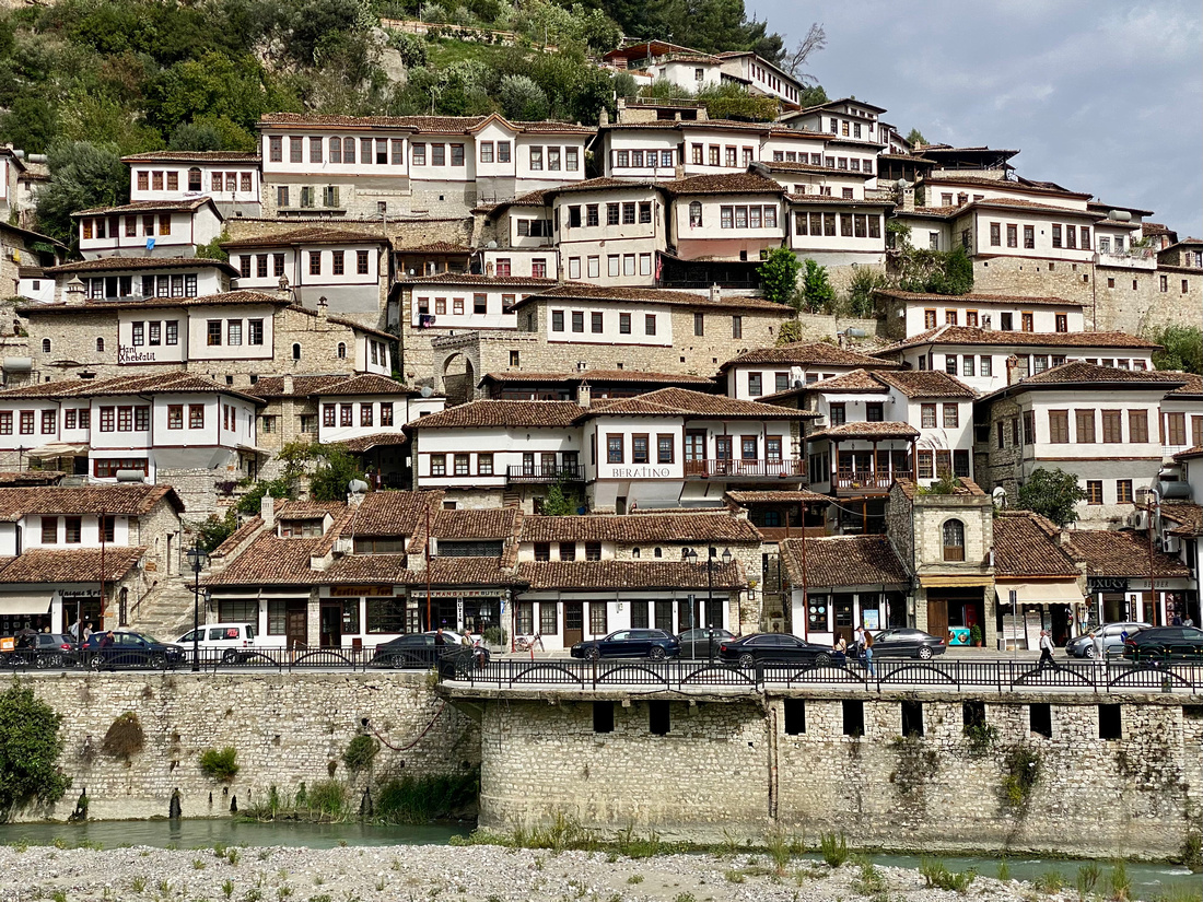
From what I could see, there was little if any difference between the houses (and their windows) in both ancient quarters on the two sides of the river.
-

Thanks Mike.
I was just going for the texture and light on the stucco wall and weathered lamp. Didn't "see" the composition until I opened the image in ACR.
Rich
-
Either way, it's nicely composed and lighted.
Rich
-
Beautiful light here and rendering of the building. The mountains are also beautiful and I can understand wanting to include them, but they fight with the building for interest. I think isolating the single subject would be compelling.
Remarkable depth of field.
Rich
-
First picture - NR was done with ACR.
Second picture, I selected the sky in Phtoshop, inverted the selection and turned that to B&W. It has no Exif because I (unwittingly) ticked a button on the image resizer which says 'don't copy exif'.Minnie, here's a version without the first bollard. Personally, I prefer the original as my eye follows the road better if the image is ling and thin. Bur feel free to comment.
-

Thank you minniev.
I did originally clone out the oof stick in the background but it then made the scene too flat for me.
The stick in the background gives the scene some depth.
-
That's why I said the shadows lightened a little looks better.
-
Thank you for your thoughts.
-

Lighthouse, thanks for looking.
-

It's more than lighthouse. Towers, cranes, lines and buildings, colours, different heights, angles. Very cool shot, not in your face but very effective.
-
Hmmmmm.......I assume you had no choice but why would you put the subject in the background!
The cranes are a distraction and detract from the image for me.
-
Essentially an abstract composition. I like it. I have several similar.
I would crop out most of the buildings and straighten the verticals a bit.
Nice work.
(For some reason, clicking on the image does not result in the usual larger display image)
Rich
-
-
I knew it was a Lou Holland photo before I saw the avatar. That is a wonderful red lighthouse, but what makes the photo special is the balanced array of cranes and riggings. So many V shapes! It borders on the abstract category with its dependence on shape, color, line. Intriguing image with a lot of visual design appeal.
-
This is an interesting conversation. It really doesn't matter whether you were thinking about any of these things or not. It doesn't matter whether you'd never picked up a camera before or never read a book on composition or visual fluency. Mike explained what is in that picture of the gull. I saw the same things.
In practicing this craft over time, we may develop certain instincts that help us react to and capture good designs without consciously considering those things. Some of us come into photography with art-related training that gave us a strong foundation for this. Maybe some of us are born with a better sense of visual design than others. But regardless of whether we consciously consider design, or subsconciously react to it, or accidentally stumble on it, a good design is still there, and can be recognized by others.


