• Members 823 posts
    Aug. 9, 2024, 7:41 p.m.

    Thanks everyone for the comments!

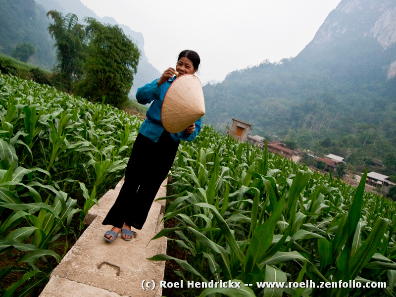
    Just a note about the reflection in the windows - The horizon is way out of kilter. Horrors! Something I never do!

    I straightened it in one of my edits, but found that leaving it crooked added to the zany look of the scene.

    No one noticed her abdominal scar, or the sign in the window. 😮

    Rich

  • Members 1802 posts
    Aug. 9, 2024, 8:32 p.m.

    Though I don't often feel the tilt adds to a picture, it does in this one. Yes, it would still be a good image if it were straightened. The halves would be pleasingly bisected, the subject would be engaging and smile worthy, the trees would be balanced by the buildings, the path and hat would still guide us through. The featureless sky would still be featureless either way. But something about the tilt makes our subject's half hidden smile a bit warmer, a bit more fun. And fun and warmth enhance connection, even across cultures and languages.

  • Members 1802 posts
    Aug. 9, 2024, 8:41 p.m.

    A very well composed and sharply taken image that would be lovely with or without your color treatment. The elements are perfectly placed for a pleasing visual, and the OOF elements, even the light and shadow, are well balanced with the in focus elements and with each other. Though the color treatment is clearly unrealistic, it is visually harmonious and almost believable in a way that emphasizes rather the beauty of the image rather than fights against it. Like it a lot.

  • Aug. 9, 2024, 8:44 p.m.

    I'm not sure if I've posted this, but here's a bee picture.

    Bee time.jpg

    Bee time.jpg

    JPG, 6.8 MB, uploaded by AlanSh on Aug. 9, 2024.

  • Members 1802 posts
    Aug. 9, 2024, 8:46 p.m.

    Agree! The joy of the race is a universal experience, transcending age, gender, country, language. This IS the Olympic spirit, and could easily be a slide in a promo for the next one. Photographically, it is well caught, sharply detailed, and the seriousness of the race is revealed not only in the concentration on their faces but in the taut muscles in those thin legs, and the high stride of the runner in the rear. The shadows of course add to the drama. And the industrial backdrop is a sharp contrast to the expansive stadium settings we see every night in the Paris version. Tells a big story. My favorite kind of photo.

  • Members 1802 posts
    Aug. 9, 2024, 9:38 p.m.

    Ok so this is Dutch Angle week. I like this one too. The crazy angle makes the super cool vehicle more of an art shot than a tribute to a snazzy antique car. The colors are overdone but that too is part of the fun here, so they work. All the zany appendages that stick out like the claws of a crustacean take our eyes in every conceivable direction. The background is appropriately quiet so we can chase down all these varied parts and enjoy the chaos. Well conceived image.

  • Members 1802 posts
    Aug. 9, 2024, 9:43 p.m.

    It looks like a bunch of us have chosen images at a tilt this week. Yours is an upward tilt with squares and triangles and a few arched curves pointing our view up, in and then out of the frame at about 11:00. The tonalities and shapes are reminiscent of some of the classic cityscape photographs by the great masters of 20th century architectural photography. Nicely spotted, taken and processed.

  • Members 1802 posts
    Aug. 9, 2024, 9:58 p.m.

    In the Stephen Shore /Jack Sprat manner of street photography. You have shown us two ordinary folks fully revealing themselves to the camera. They don't look like they're particularly happy or unhappy and don't seem stressed or uncomfortable about your popping up with a camera aimed for them. They just look kind of resigned to whatever might come along. An interesting study.

  • Members 1802 posts
    Aug. 9, 2024, 10:03 p.m.

    A pretty scene, with a rich array of colors and tones. Nice presentation of a summer garden.

  • Members 1802 posts
    Aug. 9, 2024, 10:10 p.m.

    An interesting and varied collection, each nice in its own way. My favorites are the second and the last. They show interesting views of a pleasant village surprisingly empty of people. The emptiness lets us study the details more closely since we aren't distracted by those busy, bothersome humans who steal our attention. And study lets us find interesting lines, designs, shapes, and intricacies we would not have paid mind to if the streets had been full of people. i am partial to the monochrome in the last one, very effective.

  • Members 1802 posts
    Aug. 9, 2024, 10:22 p.m.

    A nice set of a pretty little birdie doing her thing. The super bright light is never the best for birding but all we can do is the best we can with the conditions we find ourselves in, and I'm sure you've tried to do as much mitigation as you safely can. Might she be collecting mud to make a nest? Do your swallows use mud for their nests as ours do? My phoebes are mudders too, weaving a structure from grasses then slathering it up with mud to hold it together (and making a big mess on my porch).

  • Members 425 posts
    Aug. 10, 2024, 12:46 a.m.

    Technik Museum Sinsheim

    Please do not edit these photos.

    L1000005.jpg

    L1000021.jpg

    L1000131.jpg

    L1000148.jpg

    L1000148.jpg

    JPG, 5.6 MB, uploaded by Kumsal on Aug. 10, 2024.

    L1000131.jpg

    JPG, 5.2 MB, uploaded by Kumsal on Aug. 10, 2024.

    L1000021.jpg

    JPG, 4.7 MB, uploaded by Kumsal on Aug. 10, 2024.

    L1000005.jpg

    JPG, 5.2 MB, uploaded by Kumsal on Aug. 10, 2024.

  • Members 4254 posts
    Aug. 10, 2024, 1:04 a.m.

    I'm sure they make nice memory photos of the occasions but in that type of sorrounding they don't have an impact on me.

    Unless you want photos as close to documentary as possible, the photos are better if the grey bars infront of the wheels are cloned out. They are distracting eye-magnets detracting from the images.

  • Members 425 posts
    Aug. 10, 2024, 1:39 a.m.

    🤣

  • Members 4254 posts
    Aug. 10, 2024, 1:43 a.m.

    If you're happy with photos as they are, that's fine.

    For me they look much better with the grey bars removed.

    Like Roel correctly stated, there are no right and wrong, just differences in opinions.

    Each to their own 😊

  • Members 1722 posts
    Aug. 10, 2024, 4:55 a.m.

    I was running through the posts to find Alan's shots before commenting and I came across this from Bryan. I'd have said almost exactly the same and for the same reasons.

  • Members 1722 posts
    Aug. 10, 2024, 5:30 a.m.

    I don't think we have seen this shot before Alan. It's interesting to compare the two bee /flower images this week. The focus point in Alan's image is slightly in front of the bee. All the spikey structure of the thistle is emphasized but the bee disappoints. Neither does the background here help the bee to emerge. Of course, the photographer often has to work with the camera/lens and subject matter to hand at the moment. It isn't always optimal. The image feels caught between wanting to make the thistle or the bee the subject. Perhaps get in closer (or crop in) to make the bee more prominent and capture the detail. Or. Concentrate on the thistle form.

  • Aug. 10, 2024, 7:54 a.m.

    I did try and get the bee in focus, but I had very little time and the camera wanted to focus on the thistle.

    Alan