I think you found out Lou! You just edit your post, select what you want to delete by highlighting it and then delete it. You can not delete or withdraw the post however so the title will remain and you may have to insert some text in the post. I am not sure about the last part. I have tried to delete a post before and at this point in time it can not be done by the poster. One of the admin team members can delete the post for you if you wish to do that.
I liked the image as presented in monochrome but the colour version is also attractive. Using this site to do what you want can be frustrating. Hopefully it will improve over time.
As has already been said it is an excellent shot.
In my opinion the dancer on the left hurts the aesthetics of the composition, have you considered removing it?
I know it's a controversial procedure, I avoid doing it myself but in this shot I would.
The lighting is pretty wonderful on all of them. I actually prefer the first out-take to the original one submitted. The same general angle is taken but no part of the instrument intrudes on her lip.
The way you've shot close is interesting to me. I have a young cousin who plays in the local symphony and I've been taking photos of him with his violin since he was 14. I've always wrangled with how much of the violin I need to include and in what way. My own style (which I refer to as Kitchen-Sink style) involves lots of context, also known as too-much-stuff-in-the-frame, so I'd never have thought of such as this.
The gentleman's image is quite nice as well, again with kudos to the lighting.
I like the general idea of enhancing the lion statue, which might have been of minimal interest on its own, with color and some kind of simplifying effect. However, the intensity of colors rattles my brain a bit, and as I have mentioned in other responses (perhaps your photos, but not sure) magentas and purples don't have any appeal to me so I'm an unfair judge of images that are heavy in that end of the spectrum.
You may not be a famous musician but you've found some interesting ways to use selective focus to creat images of them. (BTW I admire anyone who can make their own music instead of having to rely on Spotify).
I'm more than a little bit baffled here. I see that you captured the precise moment that a ginormous bubble burst into rainbow tinged explosion. I see that the rest of the folks in the frame are more interested in something out of the frame stage-right than in the huge bubble. I think I see that the phone sensor may have overexposed perhaps being fooled by the very large swath of black curtain in the background. What I am befuddled about is how the kid with the bubble is split apart from himself. He seems to have one monochrome arm and one color arm and they both seem to be his right arm. I'm not sure if that is some kind of creative shooting mode you used for an effect or a haunted photo. Tell us what you think happened here? None of the other people have ghosts...I am so curious.
The other people were watching previous bubbles as above. Yes I could have cut back the highlights.
Good spot on the lady making them. That is some weirdness from the phone camera or the in camera software. None of the other pics with her in them show that. It seems to have taken a portion of her and shifted it backwards, including some opacity from where it was and below her shoulders. Her left arm has a b&w sleeve from her elbow down. Another to show there were no aliens around. Or maybe there were...
[edit] Just saw Rich42's post - I have no reason to doubt that...
It feels like an excellent subject for B&W. It's the lines here that are important and the fret is the detail that gives the clue. I really like the concept of the series of B&W shots exploring the details and angles of a single guitar. A framed series mounted together comes to mind. In the shot shown here, the bokeh surprised me. It doesn't look right- sort of vibration that has gone wrong. It might not be the best lens for the series.
OK, Rich's explanation makes sense. There's special settings on phone cameras and "real" ones too that blend exposures, so that's understandable. (I probably should play with those more to see what they do but I stubbornly continue to hand blend any images I want to do that with, a bit of a control freak here).
I like the ghost-less version - better exposure, and the obvious joy of the bubble-chasers. Plus the booth about brush fires reminds us where you are, with that ever present threat even in the midst of the joy and fun of play. (And oops I mistook the lady for a boy...)
In this shot, I feel that the interest is all in the bursting bubble, the lines of the supporting sticks at the front and the trail of bubbles behind. The black background does a good job of throwing these details into relief. I'd therefore crop the image heavily around these details.
However, from previous experience here I know that my tendency to crop isn't shared by everyone.
*Andrew, this is quite breathtaking. I assume you have cropped to give the panorama format. It is an excellent choice and especially when combined with the row of footlights across the front, it's masterly. The figures at each side bookend the action as does the cloud. The set designer, lighting designer, ballet master(no idea of the correct term) and the performers would be thrilled. The whole team that is ballet comes together here. It exudes live, theatrical performance. *
Whoops. this is one of the problems of a flat view forum. At least, it is the kind of problem I find I have with the format. I was hunting for images I might have missed, found one and posted.Then I find that the shot I responded to wasn't the original and that a previous conversation was underway. Oh well.......
Those cubes rising up the hillside still look the same.
One of the shortcomings of tourism is that the tourist, that's me, tends to be wherever for a relatively short time and we hole up in an historic centre where the significant old buildings and museums and quaint streets are located. I saw your lego ranks up the hillsides but I never got near them. Same thing where we are now in Palermo. This morning we went way up to Mon Reale. From there it was easy to see how extensive Palermo actually is. Far, far more city climbs up hillsides well away from the tourist centre. That's where the actual city life must be.
Your shot underlines exactlythat.
Thank you very much! I'm glad you feel that way, even though I'm afraid making music will be one of the most redundant skills in history, with the abilities of AI in that sector... I'm really happy that I decided a long time ago to make music for me and a close circle of friends first and foremost.
Thanks a lot for your valuable feedback! I absolutely get where you're coming from. The bokeh does and should feel out of place... notice the title "Signals in a foreign language"? When I saw the pattern in the bokeh I thought of some alien species sending signals through space and through some coincidence they ended up on our planet and were interpreted and seized as what we now know as 'music'. I didn't have a fully fledged story in mind, but something like that... 😅
So I did realize the strange bokeh and even exaggerated it in post in order to make it stand out more and don't blend in. This lens can actually create some quite smooth and beautiful rendering:
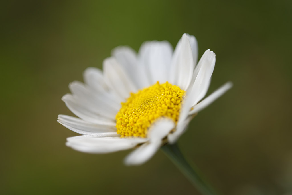
They open as daisy fit by simple.joy, on Flickr
However being a triplet and a prototype lens without any kind of real body or lens shade, it's quite prone to act in weird ways to direct or stray light and that's what I tried to use here. I get that it's not visually appealing to most people. Even I can't say that I enjoy bokeh like that in most of my shots, but it was quite intentional here. The series you're talking about could be an interesting undertaking - I agree that this is probably not the best lens for such a thing though.