Quite often, the owners tend to be more interesting than their machines. We are waiting for the pics 😀

July 31, 2026
47
-

-
¡Hola!
In the areas where I usually walk around—the city's old town—seeing lots of tourists and cameras is the norm, so there generally aren't any issues, people are used to it.
I try not to be a nuisance, avoiding children, vulnerable individuals, or situations that might be unflattering or awkward whenever possible. However, I don't mind taking the occasional portrait, whether shooting from the hip or more openly. In the case of this particular photo, I think the fact that the woman is hidden behind her hat reinforces that sense of isolation and introspection. If she had looked up, the photo would almost certainly be in the trash... -

I think this is the balanced, common sense view. There is so much talk that is amplified by social (and main stream) media, but I am sure there are many who are still capable of rational viewpoints.
An interesting side note: People talk about kids / teenagers spending their life buried in their phones. But now I am seeing snaps of older people doing exactly that. The world turns...
-
I really like it; it’s a fun situation captured in a lively image. In this case, I think the processing works well, though I’m sure I’d like the "conventional" version too.
My concern with very striking processing styles is that they can cause nuances to be lost (sometimes that doesn't matter) or even end up stealing the spotlight from the image itself... -
¡Hola!
I’m afraid Google Translate isn’t really suited for this kind of conversation, which requires nuance. I’ll simply say that, generally speaking, I feel uncomfortable seeing that in my photos the subject clearly doesn't feel at ease. But to judge that correctly, you have to be there and sense whether it’s genuine discomfort or just a pose... -

Thank you. And I agree that the processing can distract from the 'message or theme' of the original photo.
-
A Presence in His Face
😎
-
What a character 😳
-
Expo…
-
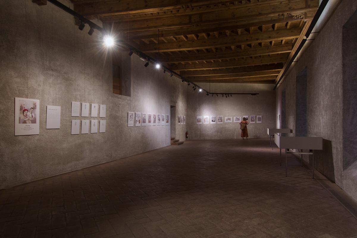
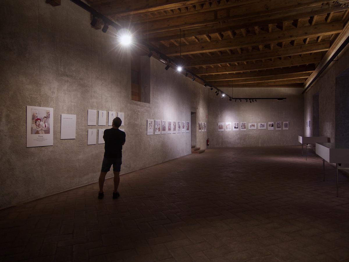
Fine interior photography under artificial light. I like the second shot for the fine silhouette of the man. Evokes a visual interest. Well done.
-
The Magazine Reader
😎 Shot through a window.
-
The issue I have with this is that the primary subject seems to be the magazine. All I wanted to know was what he was actually reading.
Alan
-
Hola Alan, I think that magazine acts, in a way, as a hook, a gateway into an image that isn't easy to decipher at first glance due to the shooting conditions (through the glass, with the superimposed reflection). From the magazine, your eye moves to the reader, the girl on the floor, the bookshelves packed with volumes... and even the reflection of the outside world. It’s an image that invites slow viewing, where the details gradually unfold and the scene comes together. And it all begins with the eye-catching pages of that magazine...
-
¡Hola! Thank you for the comment.
We agree: that gentleman struck his best pose and positioned himself perfectly without anyone even asking him to 😀 -
The situation your comment addresses results from the fact that the magazine is emphasized in the photo by its brightness which dominates an otherwise dim image. In editing I could have converted the photo to a light gray monotone and then raised exposure. That may have overcome the dominance of the magazine in the scene. The convention of street is that it is displayed in black & white or high contrast mono. But, I've noticed that most who display in this thread use color. I like that. I've been stuck within the conventions of street for so long that I find being able to display in color very freeing.
-
This is a well composed shot. I find the PP different but very effective for this particular image. What others think is irrelevant as long as you convey your vision and it’s understood by the viewers.
-
His face is full of character.
-
It is a good use of light, geometry and architecture.