The light is great here. The sky is interesting, it's the darker foreground that make those yellow fields sing out
I know what you mean about the horizon, some people have strong feelings about it ;-)
There's a great scene about this in the film "The Fabelmans" where our young hero wants to learn from a great movie director and has to wait for hours before he's finally let-in for only a few precious minutes, then... www.tiktok.com/@abciview/video/7460714361267457288
😉
I like them about the same, but I think I'm going to go with the former. The wider version "should have" been framed wider still and cropped or the camera should have been angle up a bit more (I realize it's a stitch of 5 photos, but I'm talking about the final result as "the photo"). There's "too much" foreground in the latter -- it's unbalanced and the tops of the center tree is still cut, so it gives the impression of a "compositional error" as opposed to the former which comes across as a "compositional choice", if that makes any sense.
If the latter had been framed wider still and angled up a bit, so that the whole of the center tree were in the photo (with a little clearance), then that would likely have been my choice.
I apologize if I'm coming across as overly critical, but here's a photo I took (which I like) that has the same "flaws" that I'm pointing out in yours:
This photo, too, "should have been" framed wider. And I would have done so if I had had a wider lens with me at the time, but that's as wide as the lens I had went, and I couldn't back up enough to get the "proper" framing. So, same kind of thing: photos I like that have obvious "flaws". In fact, one might say that taking "obviously flawed" photos is a specialty of mine. : )
I think I have decent skills pointing out [what I think are] flaws in photos, but don't have skills in praising photos that are really well done. Yours is an example of one of those photos I don't have the words for. : )
Thanks for your thoughts on this interesting subject.
There are many “Rules” or “Guidelines” when it comes to image composition. Some of them are even contradictory, so they can’t all be right, all the time 😉
And it’s up to us what we choose to use, or not to use.
When I see a scene, I begin to think about which one of the many “rules” might work, and try looking through the viewfinder to see how it looks. Sometimes it “works” straight away and I’ll just take that one shot. But sometimes I’ll also try a few other variants, some just a bit different, and some completely different.
When I get back home and look again on a bigger screen it sometimes seems to “work” a bit different again, or I’ll see something that I missed looking through the viewfinder. So I get a second chance to choose. Then I’ll play with cropping and adjusting. Could this be called “Guided trial and error”?
It’s all about compromises and decisions: I do like to give objects “room to breathe” in an image, so that might mean shooting wider to give a tree more space around it. The consequence, or unwanted side effect of that, might be that my “main subject” is now smaller and could possibly lose the impact it had before in a closer shot. So what to do ? Maybe I’ll to decide to crop the tree, or maybe not?
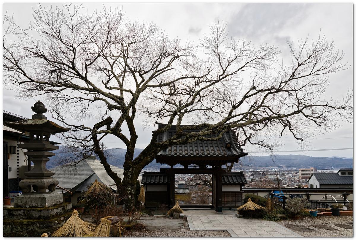
In your shot here, the outer branches are in contact to the edge of the frame, but that doesn’t necessarily make it a flawed image. The “bigger picture” is "suggested"; we know that those branches continue outwards so we don’t necessarily need to see them all the way to their ends. It doesn’t look accidental or distracting to me :-)
I like how you can also see the raindrops on the surface of the water, it fits to the "man with umbrella" title.
The circle of the arch and it's refelction is nice!
I really like this one. Beutiful wintery light. For me, the foreground textures are just as important as the sky, so I wouldn't want to lose any of the by using a lower viewpoint.
"I didn't write the rules, why should I follow them." W. Eugene Smith 😉
You are absolutely correct the wider image does tell a different story. The first one is much more intimate. It makes you want to be there. The second tells a picture postcard story. Nice but I've seen it a thousand times.