• Members 359 posts
    May 23, 2025, 6:40 p.m.

    I'm truly interested to find out exactly what you're working out, given that you don't know the actual size of the dots printed, the patterns of overlay to produce the various colours (subtractive colour), or how that relates to the actual output resolution of the photo...

    ...for someone who doesn't print...

    The floor is yours, 😎

  • Members 1570 posts
    May 23, 2025, 9:58 p.m.

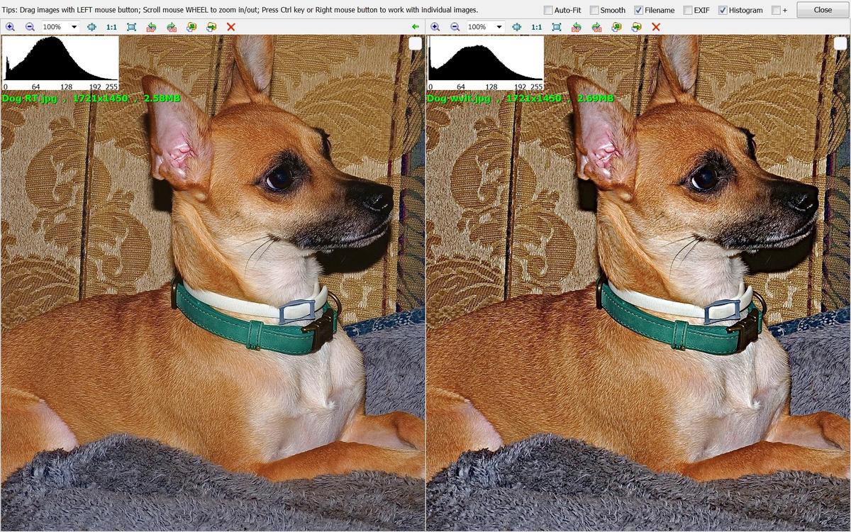
    By way of experiment to account for viewing distance, here's a dog shot;sharpened at left for normal screen viewing at about 40cm and then with local contrast about 8px increased for more distant viewing. 1920x1200px screen in my system,

    comp Dog.jpg

    View about 15" wide on your system at about a foot ... nice and sharp at left, a bit OTT at right. Now scoot back a yard or two ... with my myopic vision the dog at left blurs a bit but the dog at right remains sharp because of the greater local contrast.

    Your experience may vary but, for me, the "sharpening" for these prints would benefit from a larger radius than normal and perhaps a greater amount

    comp Dog.jpg

    JPG, 2.2 MB, uploaded by xpatUSA on May 23, 2025.

  • Members 1570 posts
    May 24, 2025, 12:27 a.m.

    ...in the same way that someone who doesn't take pictures knows nothing about photography...?

    I am still looking at SQF ,,,

  • Members 359 posts
    May 24, 2025, 8:08 a.m.

    Regarding "SQF", please see my response above:

    dprevived.com/t/help-with-sharpening-photos-for-display-prints/7246/post/102256/

    There is sometimes a tendency to confuse the spacial frequency of the dots that make up the image with the detail in the image itself, and the resolution/detail contained with the apparent sharpness. Also be wary that although the title in your link is "Subjective Quality Factor" it only deals with apparent sharpness. There is more to an image...

    Common wisdom is that the further you move away the sharper an image appears (and the dot pattern making up the image disappears), which is why billboards work. When you drop below that frequency with the dot pattern of an image and the spacial frequency of the detail in the image you are precisely in the area of visual cues that define texture.

    We're talking about a MF camera and a photo quality ink jet. On a tripod in good sunlight the crispness will be suburb, hand held on an overcast day it will look a lot softer. I've made 18" x 12" prints with 24mp that are superb, and look even better when viewed at 5-7'. Use an MF camera and they would look good close as well.

    As for you samples I think that they are quite lo-res images for screen (look at the strands on the mat) and over sharpening to compensate is not going to be representative of an MF image for print. I find the one on the left looks better at all distances as it "holds the impression of finer detail" and at least a semblance of the different textures of the different materials. The one on the right reduces the appearance of everything to the same "SQF", even from across the room the one on the left has far more natural looking fur...

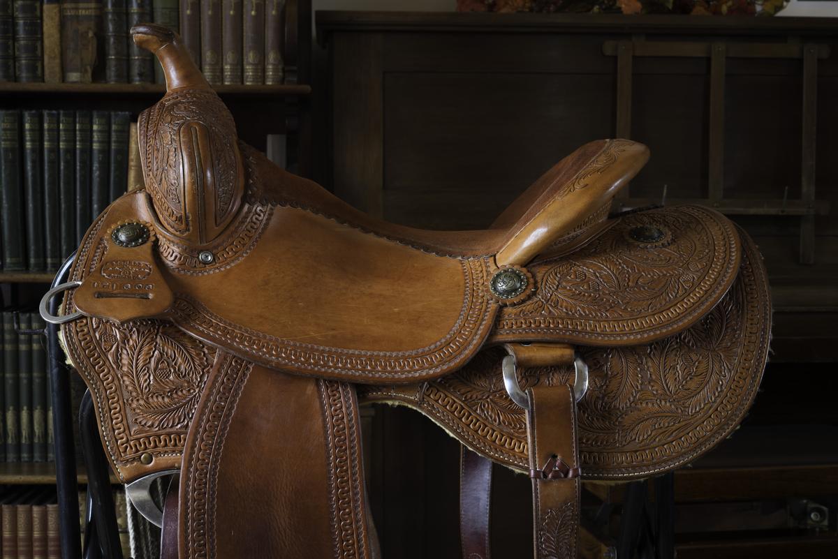
    A 24mp image from a D600:
    _DSC1436.jpg

    For a good approximation of how it will print view at 100% and step back. But be wary that screens normally have much higher contrast so in a direct comparison the high contrast will "appear" to be sharper (so make sure the prints are well lit). To match that in print with sharpening tools then effectively what you do is bluter the detail to make the contrast appear similar when viewed further away, the photo becomes a "50ft second hand car", or one where the illusion fails as you move closer...

    But sharpness isn't everything...

    Saturday's Cat.jpg

    Saturday's Cat.jpg

    JPG, 639.5 KB, uploaded by Andrew546 on May 24, 2025.

    _DSC1436.jpg

    JPG, 5.0 MB, uploaded by Andrew546 on May 24, 2025.

  • Members 1570 posts
    May 24, 2025, 6:44 p.m.

    I finally found a correlation between the print and the sensor:

    Correlating print and sensor visual cpd

    from the well-respected Jack Hogan's formula:

    f(sensor)=180/pi x retina-cpd / viewing dist x dp/ds where dp/ds is the ratio of the print to the sensor diagonals

    www.strollswithmydog.com/mtf50-perceived-sharpness/

    for a 16x20" print viewed at 1.5 m and the MF sensor, ds = [55] mm and dp = 651 mm > dp/ds=11.84

    pixel pitch = 44mm/8256 = 5.329 um, perhaps should be diagonal pitch

    f(sensor) = [2.715] cy/mm -> [30] px/cycle / 2 = [15 px radius USM] or deconvolution;

    or wavelet detail size level 5 [(32px)].

    Offered for what it's worth.

  • Members 478 posts
    May 26, 2025, 8:37 a.m.

    On my 49" 4K screen (I also have larger ones), the image on the left is more pleasant, seen up to 3m away. Properly scaled to 3840x2160 resolution and slightly "enhanced" with other clarity-enhancing formulas, the one on the left looks better, more natural, from greater distances anyway.

    I can print images up to 12"x20" on canvas paper, the images do not need to be processed differently than those that are going to be printed on normal paper.

  • Members 1570 posts
    May 26, 2025, 2:19 p.m.

    Thanks for trying it out with a different monitor, viewing distances and processing. Your experience certainly differed from mine and I'm thinking of figuring out a number for my monitor and looking at the dog again ...

    Point noted. It's saying that @barondla can ignore my posts ref: SQF.

  • Members 478 posts
    May 26, 2025, 2:28 p.m.

    You just need to deliver the photos in RGB color mode, at the maximum resolution offered by the camera, processed in terms of chromaticity and contrast as you wish, preferably without applying sharpening, and mention what the final product should look like.

    The print operator should give you the available options to choose from, and the rest is none of your business, unless you know exactly what it is about.

    There are several solutions for canvas effect prints.