Right.
Why don’t you try a variety of output resolutions on various canvas substrates. Then the concept will no longer be abstract.
To you.
Rich


Right.
Why don’t you try a variety of output resolutions on various canvas substrates. Then the concept will no longer be abstract.
To you.
Rich

I don't print. My only interest is in the OP's question, i.e. the relationship between sharpening and the viewing medium.

There is no absolute or mathematical relationship, it's a perceptual relationship at best.
"Sharpening" is an illusion, it's little more that boosted acutance or local contrast across boundaries. Textured paper adds to the effect. The actual acutance of the object itself (water drops on polished cars/small ripples on smooth water) along with our expectation as a viewer based on memory of how sharp we expect the object to be are both equally as important to the overall effect. This is also why photographers tend to over sharpen, because they have an expectation of how good they believe their kit is and need to see that reflected in the photos as a metric they understand.
But it is really just illusion, boosted acutance, or the local contrast between boundaries. You can create a super sharp A1 print with a 2mp camera if you choose the correct subject, and equally fail with a 48mp camera by not understanding it. As long as the PPI of the file is above 150-200 then the print driver/software has enough info to interpolate the info into the pattern for spraying the actual coloured ink onto the paper without really "losing" anything. It's not really about preserving sharpness, it's about translating the data accurately from the digital file to the actual ink on the paper.
After some thought, I am thinking that the Subjective Quality Factor (SQF) has a bearing on how much and what kind of sharpening to apply for these prints.
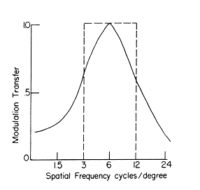
See bobatkins.com/photography/technical/mtf/mtf4.html and read it a few times. We learn that the printed size and the viewing distance come into play and that trying for max detail at Nyquist on your screen is not necessarily optimal. SQF is based on the human visual system as regards frequency in cycles per degree of view.
Viewing distance is definitely involved. Look at a billboard up close and it is mush. Appreciate the link.
Thanks,
barondla
Thanks. Do you happen to know an average viewing distance for say the 16x20's? Or could we say the conventional diagonal measure of 26"? I'm working on a suggestion for sharpening based on SQF ...
Still think you're missing the point here. It's not about trying to find a mathematical formula for "maximum sharpness" it's about finding a visual preference for and understanding variations within.
"Sharpening" is a subtractive process, it removes data to boost edge contrast. It doesn't "reveal detail" it just picks out sharp edges and lightens one side while darkening the other. See "halo"... Sharpness is also an irrational concept for things like mist, dawn, soft skin, pastel, dreamy, late summer afternoon...
Nyquist values of screens is not comparable to prints, (it's not even comparable to screens with jpeg images over the internet). The actual semi-random pattern from modern 6-8 colour ink jets is a complex algorithm, it's designed so any size is optimal, there is no "matching DPI" with modern printers. It is quite literally "try it and see if you have a visual preference."
For a true revelation try looking at an optimal wet print from an optimally exposed and developed large format negative, truly. Light passing through the fine grained pattern on the negative and forming an equally random fine grained pattern on the paper viewed at normal viewing distance can often exceed the acuity of human vision. But it's not "sharpenss" you see but real palpable texture to the objects.
Ink jet printers have a fixed maximum resolution. The only way it can exceed human acuity is with viewing distance, over which you have no control. There is no simple formula to match photo resolution to printer resolution because printer drivwers are specifically designed to alliviate the need. As long as you keep it above 150-200 for normal viewing distance you should be ok.
It's not a maths problem, it's a visual one and so the solution must aslo have a visual understanding rather than a mathematical one.
Oh ... and thank you for Unsharp Masking 101 - I would never have known.
But rational enough for things like the offices and buildings in this thread, don't you think?
But you do seem to be trying to link photo resolution to print resolution (dpi) and the output parameters of the unsharp mask tool. Modern ink jets use 6 or more colours with variable drop sizes and semi-random patterns to produce the output print. There is no simple correlation between input and output resolution and the advantage is output is consistent regardless of the relationship. And because the sharpening tool doesn't actually sharpen but only creates the illusion of sharpness, it is a largely perceptual effect rather than an actual one.
No, TBH. I see a lot of photographers who understand an unsharp mask but still apply the literal definition of the word as an understanding of the effect. So many times (on other forums...) I've seen photographers claim they've "revealed the texture" through sharpening. When in fact they've blutered it. It's not as simple as the Photo Gods saying, "let there be light!" Then on the second day , "here's an unsharp mask, that's our work done and we can get an early finish...".
Ask someone to draw a building and they invariable draw an outline. Trouble is that often the way we categorise and reproduce often limits our of understanding of an image. We see things as a series of lines rather than planes of texture and colour, we see the building as a series of edges.
I scan and print from large format B&W negatives, normally A3-A2 sizes and it's a real balancing act to retain the texture that exists in a real wet print because a wet print has something a computer screen doesn't have, a random dot pattern that's below the level of human acuity. That's where the real texture is, when the pattern of those grains that make up the sharp or smooth gradations of tone are so small they become seamless. All sharpening does is take that micro gradation and turn it into a macro pattern. It's necessary because (as you know) the scanning by fixed pixel devices often places a sharper gradation across adjacent pixels and so naturally softens it. The unsharp mask doesn't correct this and put the sharpness back but rather further subtracts by increasing the contrast of adjacent pixels to give an illusion of sharpness.
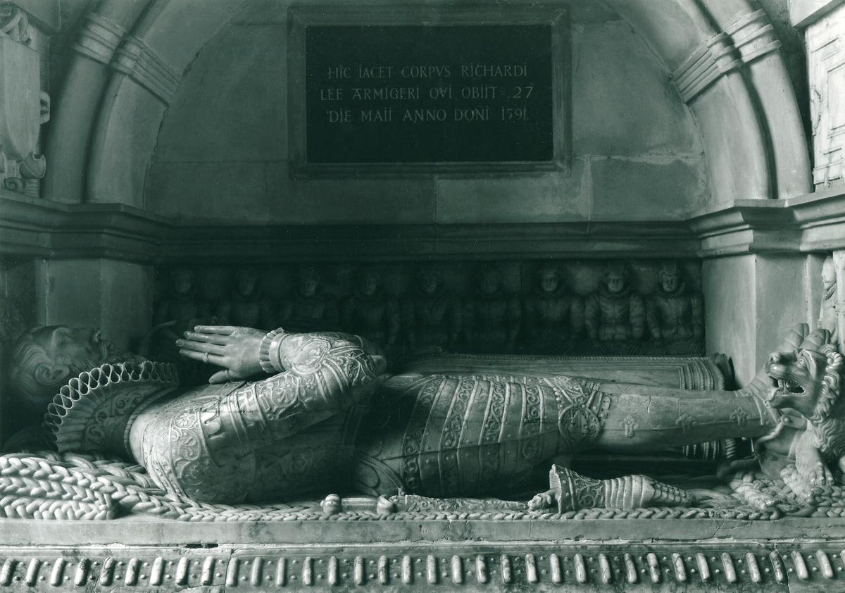
Below is a scan of a wet print made with modern 1/2 plate sheet film in a camera and lens combination from 1898/1910. There is a difference in texture between the sandstone in sunlight and the marble (another building material 😀), matt to polished, and even between the appearance of the marble from sunlight to shade. Even a Retina screen doesn't do it justice, in the print the marble looks almost cool to the touch and the mortar retains it's powdery texture, somewhat lost in the scanning process. To really understand it fill the screen at 100% and stand back. Trouble is, many photographers start by doing the opposite, sticking the nose close to the screen and trying to get that to look sharp. Which is the opposite the the piece you linked to.
Just sayin' that there is a whole other depth to this subject that a short response often fails to communicate.
I am currently looking at SQF - so please pardon me if I don't respond immediately to the many points made above.
Ted, please ... :)
Offending post duly edited 😕
Barondia, I withdraw my earlier comments/questions re: ppi.
Pentax 645Z sensor 8256x6192px
8256px/20" = roughly 400 ppi assuming full-width image and no matting, or
6192px/16" = roughly 390 ppi
and in most printing options, the ppi is set by the app, not by the User.
Yes Barondia and, for a print, the further away one gets, the larger the details which represent six cycles per degree have to be. And details whicn represented six cycles per degree at the conventional distance would have very little contrast to the eye at say five times that distance.
Again, do you happen to know an average viewing distance for your prints?
It's not a optimum where detail decreases, it is the point where the dots (multiple sized and semi-random pattern) fall below human visual acuity and so cease to be visible. This isn't the detail in the print but just the pattern of dots making up the detail. As they get smaller (relative to the "detail") they get less susceptible to viewing distance and up to a point the texture revealed gets more realistic. Honestly, take a look at a good large format print.
The detail in the print, you would think, would also diminish as you move away to a distance where it falls below human acuity. But unfortunately human vision is so heavily guided by memory, (what you remember when you stood close to the print/what you expect based on experience as you approach) that it's impossible to give a definitive answer based solely on the physical characteristics of the print. Back to perception again, you simply can't assume that the characteristics of a print are fixed absolutes when viewed by a human eye, you have to allow for the nature of the optic that does the viewing. What actually happens to the detail when the dots that make up the print become invisible is that it mirrors what you see in normal life, how detail works when you move away from real objects, and so looks natural, normal, more real...
This is further complicated by the photographer who is looking for the sharpness he associates with his level of kit and the viewer who is looking for something that fits more with their memory of seeing something similar. Often, if sharpening is a concern it's because of the former and taking the advice of someone who's printed a lot is a wise decision.
P.s. My apologies for saying unsharp mask when I meant sharpening in general. All sharpening is basically the same, it all basically uses the same illusion, and it's always destructive. 😀
Enough now...
I would estimate between 3-7 feet. It is an entrance to a very big area.
Thanks,
barondla
Thanks - by coincidence I was already working with an estimated 1.5 meters average viewing distance, about 5 ft.
[edit] In the MTF curve above, it looks like the Y axis is scaled 0-10 but is in fact 0-1
I'm truly interested to find out exactly what you're working out, given that you don't know the actual size of the dots printed, the patterns of overlay to produce the various colours (subtractive colour), or how that relates to the actual output resolution of the photo...
...for someone who doesn't print...
The floor is yours, 😎