I don't mind the image but the sculpture seems a touch bold or futuristic and out of place given the wonderful scenery behind it.

Sept. 2, 2026
48
-

-
I don't know what software you have but you have given the image a shot of life like action that it was screaming for. I would say save your money, you are doing just fine as it is.
-
This may just be my bias as a long time but now seemingly marooned old surfer. The surf is always better when the wind is blowing offshore - off the land. To us at least, the ocean therefore always looks more appealing, manicured with an offshore wind. I think it's true though as bottom features are more defined, turquoise colours stand out, etc if the water is clear.
But it looks warm and tropical with clouds to match. Just coming out of winter here and I would love to have a swim in a warm ocean... -

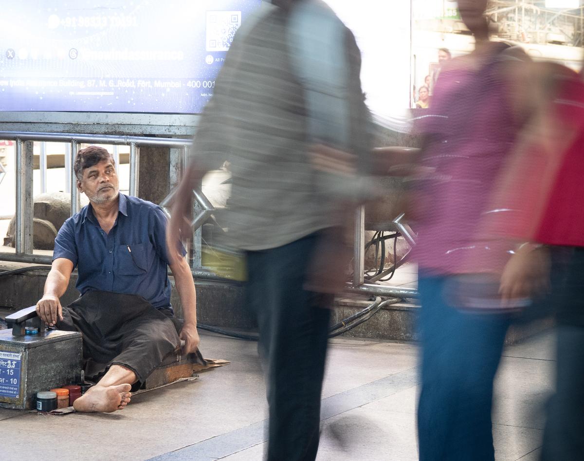
The Shoe Shiner
Whilst in Mumbai, I noticed this shoe shiner in a busy station. He was having a slow day, so I wanted to depict that by showing him between blurred people passing by. I waited ages, but never got the shot I wanted. A man came and stood talking to a second shoe shiner and he would have been in my frame. Then the passers by came in swarms when a train arrived, totally obliterating my shoe shiner and then just going past singly.
This was the best I managed. The shoe shiner is not in the centre, but pushed off to the left, which was a back-up composition. But what do you think? Do you think this still gets my message across? Is my original idea uninspiring anyway? -

I see that he isn't part of the life everyone else is living. Less money, less social standing, unbalanced with the modern world (the edge of the frame as an allegory), everything speeding past him, stuck at the crossroads. I might reduce the exposure so he is sitting in shadow while everyone else passes in the light. He looks like he is considering what following everyone else would mean for him.
-
As is clear from JS's comments, your message does come across quite clearly.
The position of the shoe shiner in the frame and the difference between his inactivity and the flurry of people rushing by is really all it takes.I don't think that I agree with the suggestion to selectively reduce the exposure.
That would feel like a trick upon a trick (the slow shutter is the first "trick") and would probably be too much in-your-face.
Moreover, I don't think the shoe shiner would have to be "obscured" with less light on him. He is invisible enough to those passers-by without a need for shadow.
Even a spotlight on him would probably not result in him noticing him.Let me add something that really caught my eye.
-- The shoe shiner is, himself, shoe-less.
-- And the rushing people do not have feet. No shoes for him to shine, here. -

Your intentions are clearly visible.
However, the person in the red shirt distracts from the shoeshiner.
That is why I would have cropped this photo differently.
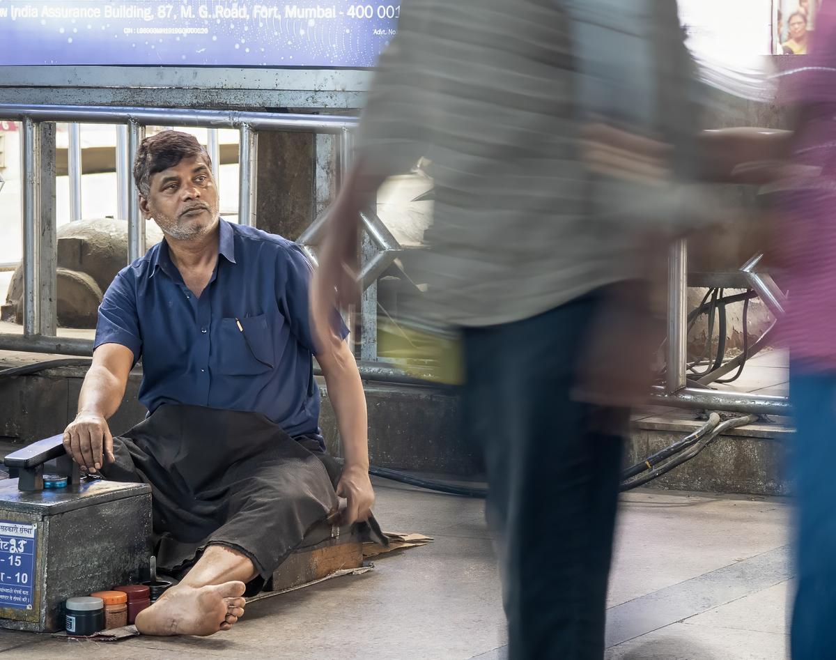
Also, I tried to minimize the blur and noise using the software available to me.
I hope you don't mind. -
Yes, you captured a wonderful juxtaposition! As Minnie says, the composition and colour palette shine through this unfinished version. Your recipe for processing sounds good and both Andrew and Kumsal have followed it and proved it works. As with cooking, their results are slightly different, even though they followed the recipe, showing the cook‘s own taste and interpretation influences the final result. I am sure your version will be different again.
-
An interesting building, and your choice to place it left and leave space on the right for the attractive sky works well.
-
The rainbow makes a huge difference and lifts a very nondescript scene into an attractive image. The rainbow stands out well against the plain grey background, and is placed perfectly in the composition.
-
Ha ha, yes some serious acrobatics will be required to continue the journey with the G!
It is an amusing scene, and the beautiful scenery takes a back seat whilst taking in the sculpture. -
It is certainly a picturesque scene and exactly how we dream a rocky Caribbean beach should be. The colours in the water and rocks are lovely and complement each other perfectly. We also think of pirates, and , sure enough, they are sailing past in their Piratz boat! Together with the people on the beach, they bring the scene to life and show scale.
The composition is good with a diagonal line linking the people, the rocky tongue and the Piratz and in doing so, also leads the eye from the rocks through the water to the sky. Very neat. -
You certainly find some exotic lenses! But more importantly, you know how to use their unique qualities to good effect. This is no exception, with the tiny shoot of green in sharp contrast to the mainly brown blurry background. It works very well.
-
I don’t mind at all and appreciate you taking time to work with it.
I understand your point about the red on the right distracting and agree, however I would not crop quite as much. There are some subtle flashes of silver amongst the blurred pink lady, which I think are an important clue to relative wealth compared to the shoe shiner, so I would just crop off the red.The comment about making the shoe shiner darker is interesting, as I have actually already made him brighter! (Sorry, Roel, I have already used one trick too many!) In the original the shoe shiner was in shadow, and was a bit lost. I know that was the whole point of the photo, but I felt the viewer had to notice him to allow the picture to convey its message.
-
There was not a trick too many, because it worked.
I agree with the back-and-forth on cropping the distracting red:
-- Yes, Kumsal, it was a good idea to crop (the more squarish crop that brings the shoe-shiner's foot closer to the bottom edge also weirdly succeeds in emphasizing him a bit more: he gets just a bit more weight in the overall composition)
-- But also yes, Pete, limiting the crop to just the red distraction is better: I had not consciously noted the flash of silver on the pedestrian's arm, but it is there once you mention it and it is a valid element in the narrative.