Nice series.
Spring is definitely coming !

March 18, 2026
33
-

-

Both are quite nice. The compositions and angles in both are very good, full of sharp angles that work well together. The monochrome is well suited to the subject matter and shows off the intricate details of the classical building and the modern wires and racks that look like parts of a trolley system. But the orange and blue color combination is simple enough to perform almost as well in the color version, and they are my favorite complementary colors. To me, they are equally pleasing.
-
The contrast between the overladen local merchant and the tourist with only her shopping bag and walkabout camera is the story here. Punctuation is the match between the smiling graffiti and the smiling cartoon characters on the merchandise.
-
I agree with the comment someone made about the Torii gates. It was the first thought I had. I like the photo a lot, with its cool/warm contrast, it's simple, centered composition, and the peekaboo glimpse of the sun at the horizon. It needs a tad of straightening, though. It has a leftward tilt.
-
A very nice image with excellent balance thanks to perfect placement of the curving line of road that leads from foreground to midground before disappearing into the trees. The humans are well placed along the lower right thirds intersection and halfway through the first curve. Though they are not in the small swath of golden light that sits upon the arrowhead of snow, their presence is illuminated by it just enough to guarantee that we don't miss them. The distant mountaintop shares that same light to hold the image together. Well done.
-
That's a huge load. Looks sort of funny being all furry and cute, but I bet it's quite heavy. Hope she sells well at the market
-
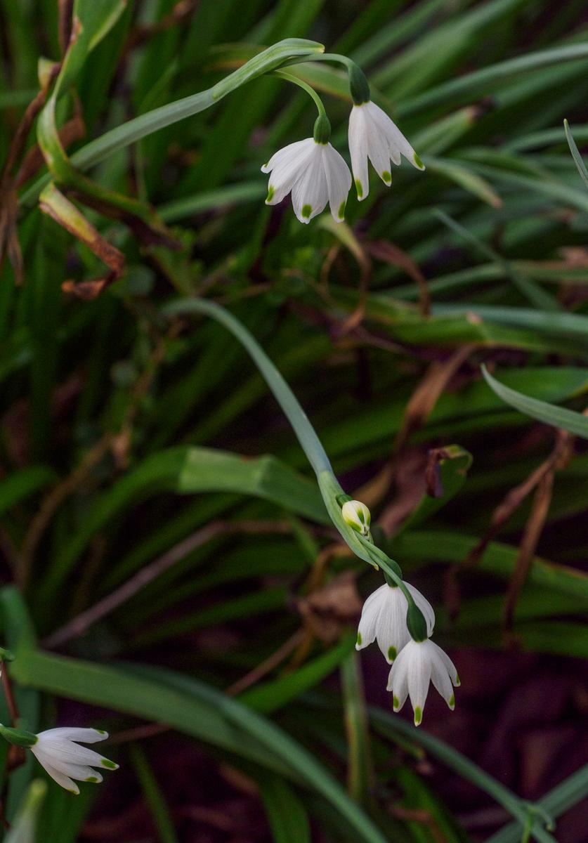
Close cousins of one of my images. These little beauties are harder to capture than they look like they should be because of how they grow. Yours are very nicely caught, with plenty of detail.
-
I prefer the colour version. It's bright and cheerful with nice framing of the tower.
The B&W feels, for me, just a bit too cramped at the top of the spire.
-
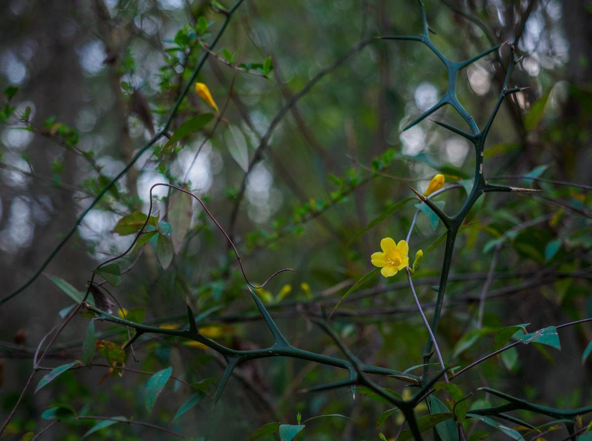
I quite agree with you on the proportionate size of the flowers. My alternate choice on the jessamine would have served better.
No, the snowbells are cut off in the raw shot. I originally intended to crop that bottom set off then later changed my mind. However, removing the bisected bloom may work a bit better than the cut in half version. One set of one, one set of two, one set of almost three.
The trillium perhaps does not belong anyway. Maybe a set of groundflowers would suit it better - with clover, violets, henbit.
-
Thanks.
This was the only one of all the flowers in the sunshine when I got there.
I had to lay on the forest floor to get the angle I wanted for this shot 😁 -

Thanks minniev. You picked up what I was trying to convey. They are in stride and both off to the same market But.....
-
Yes, I think the alternative jessamine is right for the series. Ditto your handiwork on the last image. There is also now a consistency of exposure that feels important to the series. Spring isn't here yet. At this point we have just a few cracks appearing in the gloom of winter.
-
Oviously you were prompted by the same glimmer of Spring that stirred minniev. The same mood, the same flowers and colour combination but a different take. minniev's snowdrop have smaller flowers, longer more delicate looking stems and more "down" movement. If I was still teaching I'd borrow this shot from Fireplace plus minniev's last shot and suggest students write a comparion of the two.
-
Agree completely.
Great how the horizontal lines of the bench line up perfectly with the horizon, and how the sun makes its appearance in a way that simultaneously disrupts and emphasizes the regularity. -
Your title was a hint in that direction, but a sufficiently subtle one.
-
They are indeed similar but still very different.
One shot is documentary and a great part of the essay, the other treats the subject like it is in a wedding photograph. -
The colour treatment is indeed not "natural" but a combination of over-desaturation with brightness.
I was going for the look of old postcards, in both images, but with a more edgy positioning and treatment of the subject than old postcards usually would have.