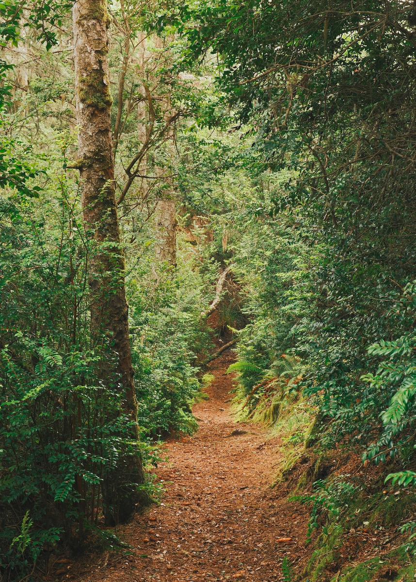
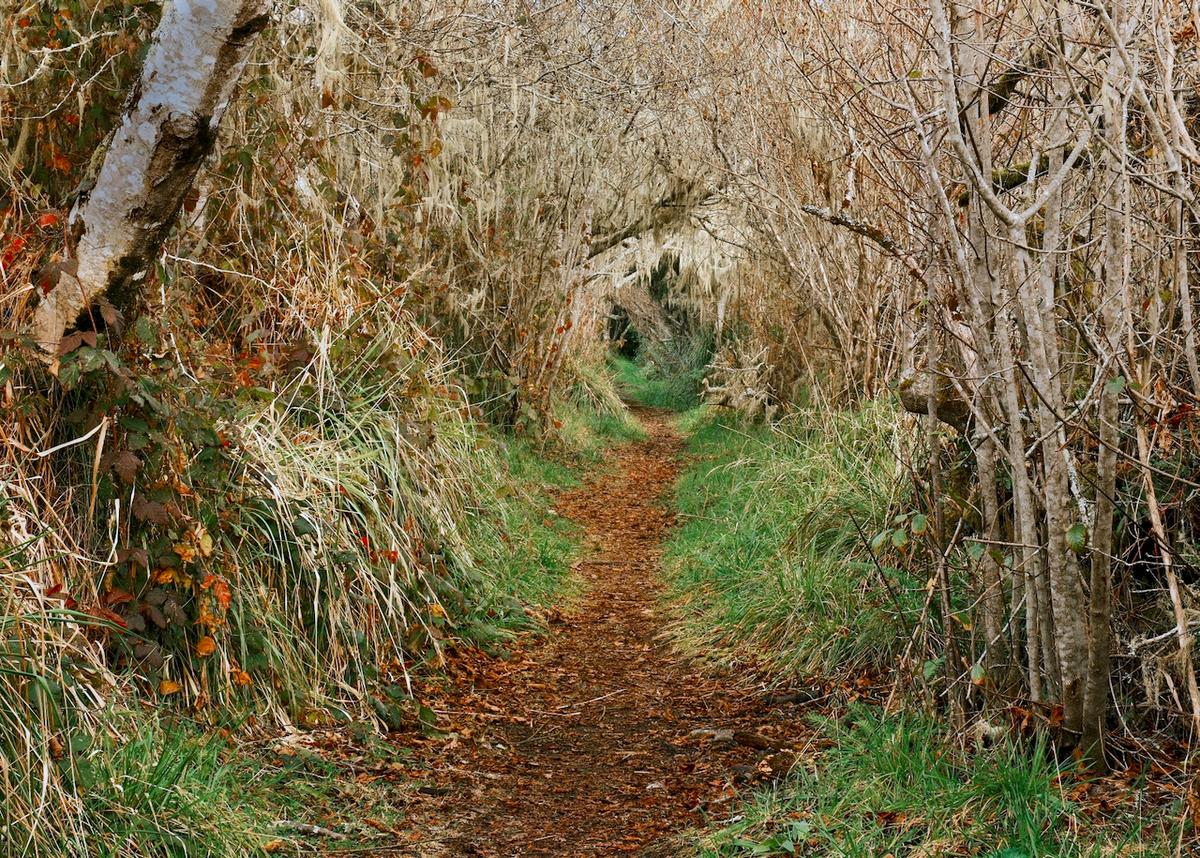
Great image. Feels a bit like a pencil color monochrome. I'd be curious to crop out a bit of the bottom- almost just above the bump on the left- into even more of a 16x20 format.

Jan. 30, 2026
27
-

-
A couple of three-image stacks for a bit of help with depth of field. C&Cwelcome.
-

In first image the tracks look like wound in the forest.. Love second image. And for third you could have written moon instead of sun and I'd believed it, looks more like nightscape.
-
Looks like trees are fighting over their fallen friend in the background. NIce scene.
-
Wow, seems like shots from enchanted forest, especially last image.
-
Very moody with such dark scheme. Fischer on image is great, gives better sense of scale, at first I thought that the foreground is more distant.
-
I agree, on foreground there is not much to look at, maybe adding bit more contrast and colour to these ice blocks would work.
-
Nicely processed. The result gives us a warm and friendly woodland area that certainly looks magical.
-
I'm a big fan of frost on trees like this, especially when there's some nice light catching them. The snow looks good, white with a slightly blue tone, just as I like it :-)
-
I like the second best.
I guess the stacking was "focus stacking" to increase the DOF. The technique can certainly help to add in more areas, at different depths, that are all sharply in focus.
Sometimes it's just what you want/need in an image, other times it's the out-of-focus areas that are used to create more depth and separation
Oh, all these choices , choices, choices ;-) -
Many thanks :-)
It seems no one, except me, likes my first image.
No worries, we all know tastes are different. And to be fair, no one liked it either, when I posted it once before, a year or two ago ;-)In that image I quite liked the way that the path looks interesting with high contrast patches of white snow on the dark ground below, and
it's sort of dynamic, caused at speed, while the forest is still and stationary in the fog.
And since we usually need paths in the forest to hike on, I feel it's not like a wound but just a contrasting line underscoring the forest's natural environment.
But looks like I'm in a small minority here :-)